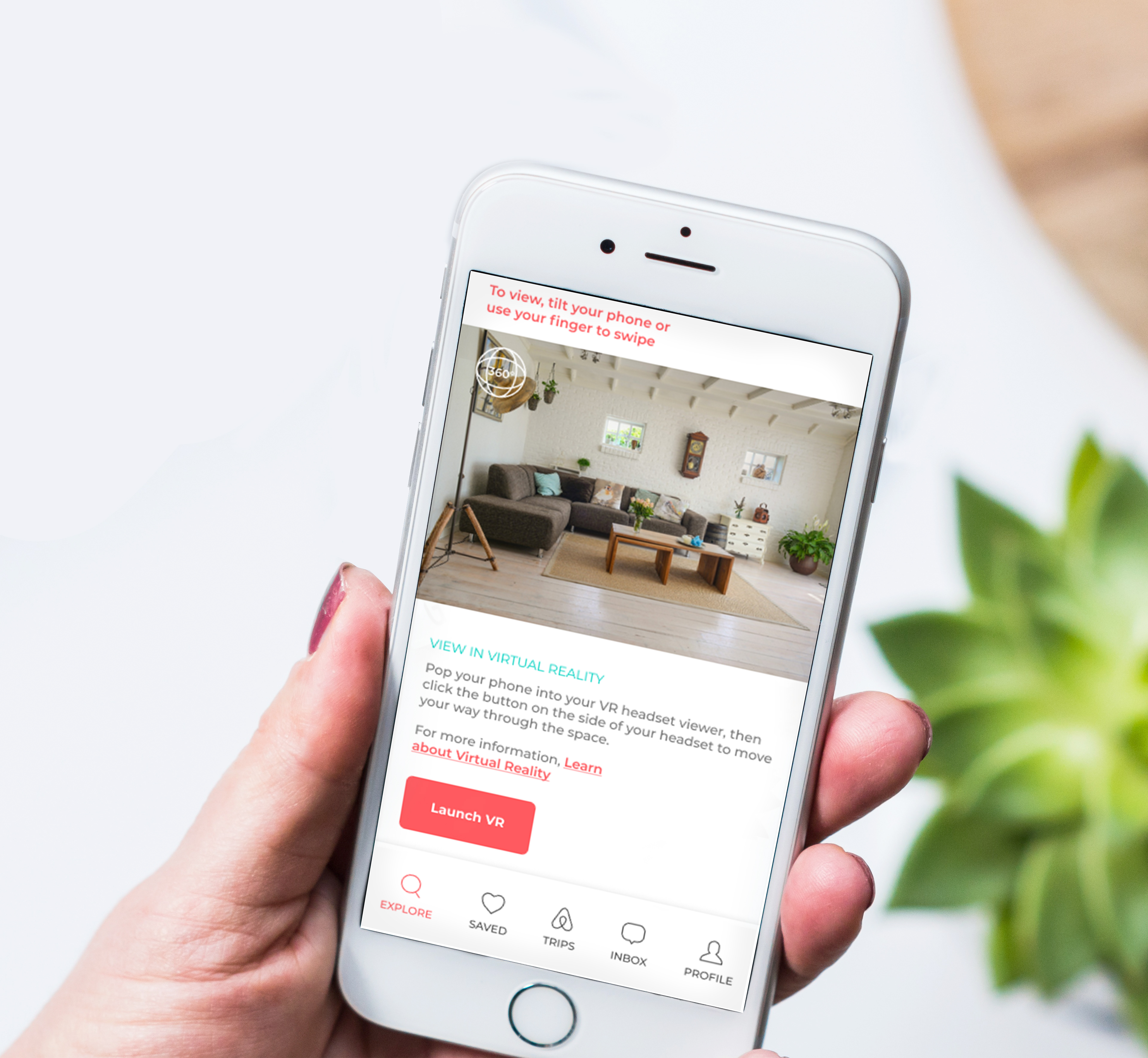
This UX Redesign envisions the future of the Airbnb app in 2030. The redesign brings to light how the technology of the future could change for the better the way that we interact with an application.
As a team, we conducted user research, created wireframes, built prototypes in Figma, presented a case study and redesigned the user interface.
The complete redesign and case study presentation follows.
Click and scroll on the phone below to interact with the Figma prototype.
Case Study & Process
Introduction
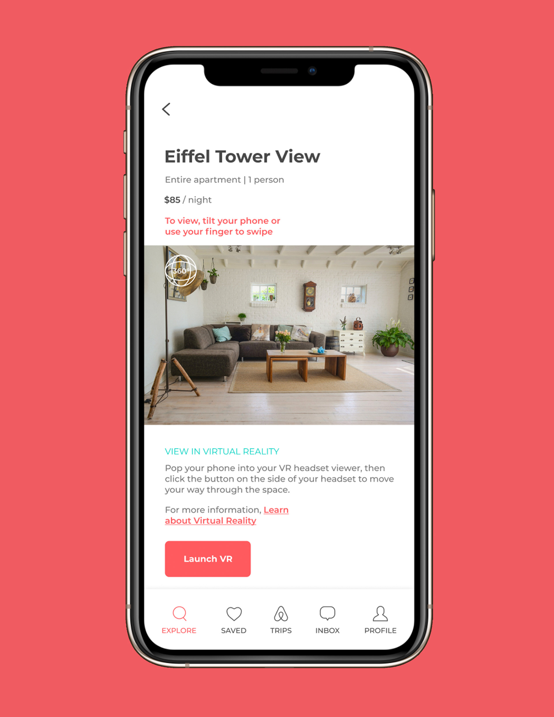
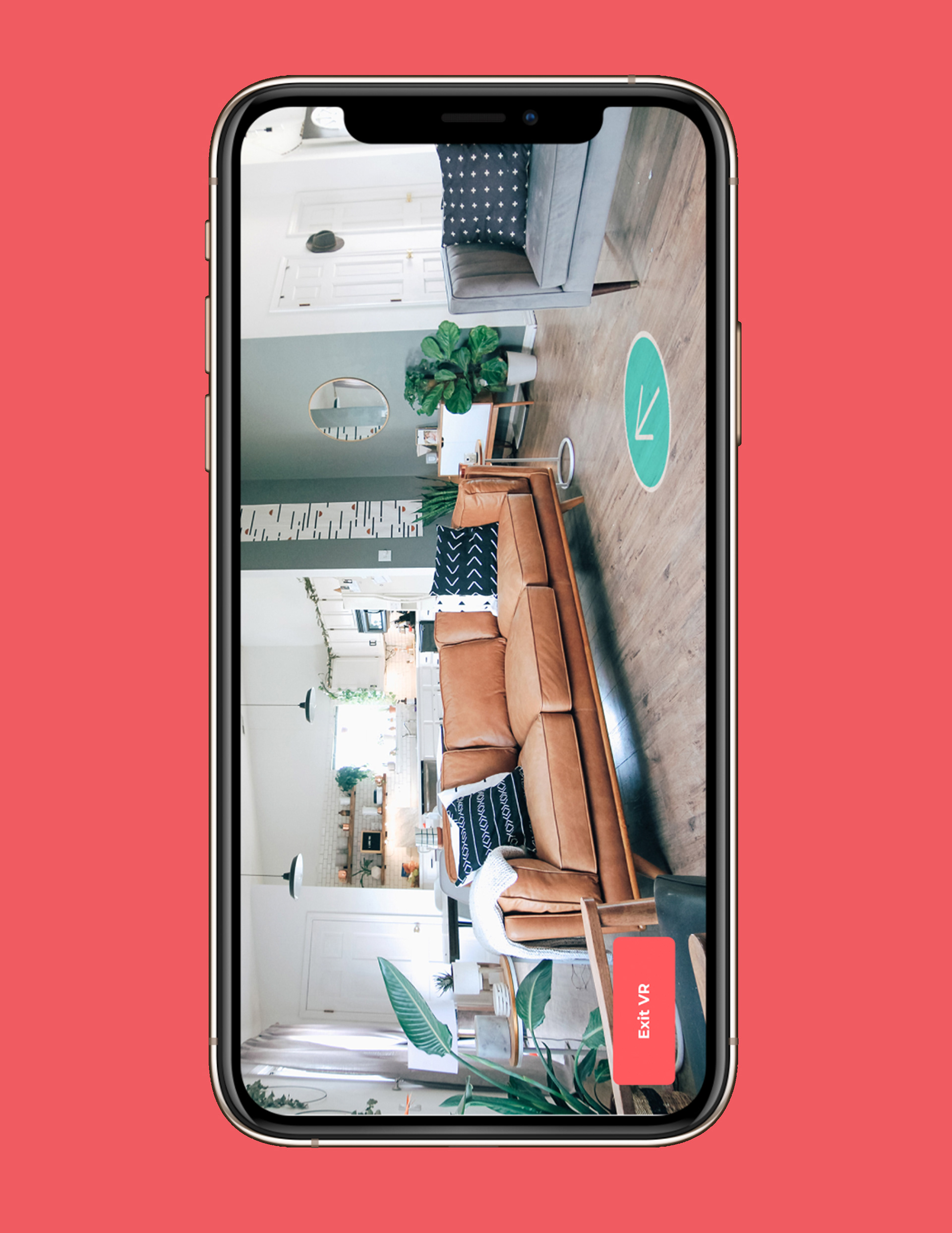
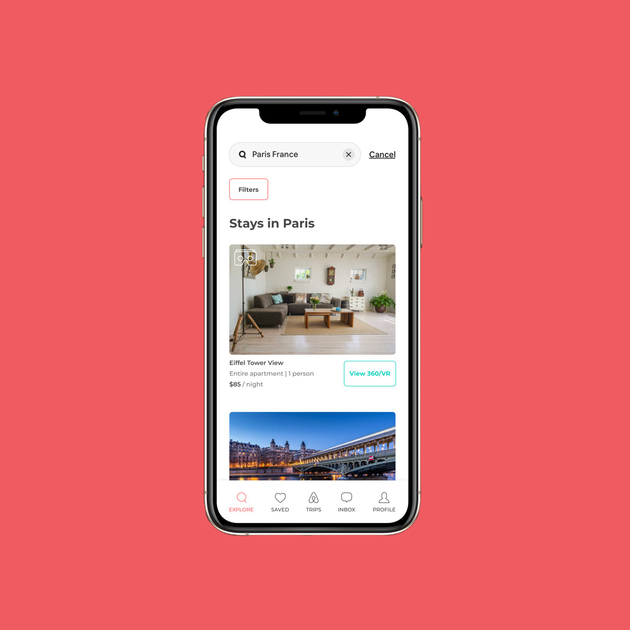
We decided to focus on space-viewing features, search improvements, and ease of check-in. After researching users’ experiences with Airbnb, several common ideas became apparent. Users would prefer to be able to see the space they are going to rent in greater detail. Another issue we focused on is ease of checking in to the space. Finally we decided to solve the issue of users not having similar preferences to the hosts. We conducted a survey of Airbnb users and potential Airbnb users to find out what they liked—and didn’t like—about the current app experience. The screens shown here were created collaboratively; illustrations by Paige Rittenhouse.

Research
We started the redesign with extensive research. First, we made assumptions by answering framing questions and creating several hypotheses. We tested the hypotheses against data through interviews, a survey, and competitor research. We decided to make the user experience central to the design, while retaining much of the original style of the app and making small changes to the brand to modernize the design. We approached the problem by considering, “what is the best version of this app in 2025?
Strategy Statement
For travelers in search of adventure, the Airbnb mobile app provides users with customized browsing, new viewing technology, and a smart-home system to ensure a personalized experience.
Target Audience
Whether you are looking for adventure or affordable travel, Airbnb’s ever-expanding community is ready to welcome you as a host or traveler so you have a local, authentic, diverse, and inclusive experience!
Ages: 20 to 65
From: The United States
Travel Experience: Personalized and Inclusive
Survey
We did a survey in order to better understand the audience and their needs. The full survey results are in the case study.
Definition
We had explored the potential of standardizing all Airbnb photos while also incorporating video space viewing capability. We had the idea of creating a service for hosts to either receive special photography or videography equipment by mail, or allowing someone from Airbnb to come by and film their space. We thought this idea could help heighten the overall quality of photos and videos being posted by hosts, and in return hosts would likely receive more guests.
Some other ideas we explored included adding a user flow for the host when listing a space, leaving reviews in AR space, adding an in-app messaging system, and sending out email recommendations of things to do near the place the traveler is staying. We chose our final concept of creating a VR/360-video experience, updating the search function, and updating the check-in process because it best aligned with our strategy statement and overall vision of the product.
Based on our research, these were the top three redesigns that would make a better experience for users and differentiate our redesign from its close competitors. We felt this direction would best bring the app into 2025 while giving the app’s users the changes they wanted most.
Product Statement
For travelers in search of adventure, the updated Airbnb mobile app provides users with customized browsing, new viewing technology, and a smart-home system to ensure a personalized experience.
Visual Design
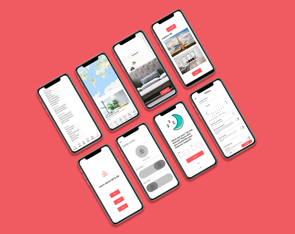
This is a sampling of our first low-fi prototype designs. We wanted to give the user an idea of the final design without going into too much detail with time-consuming finished graphics. After the testing phase, we made significant improvements to the design.
Preliminary Designs
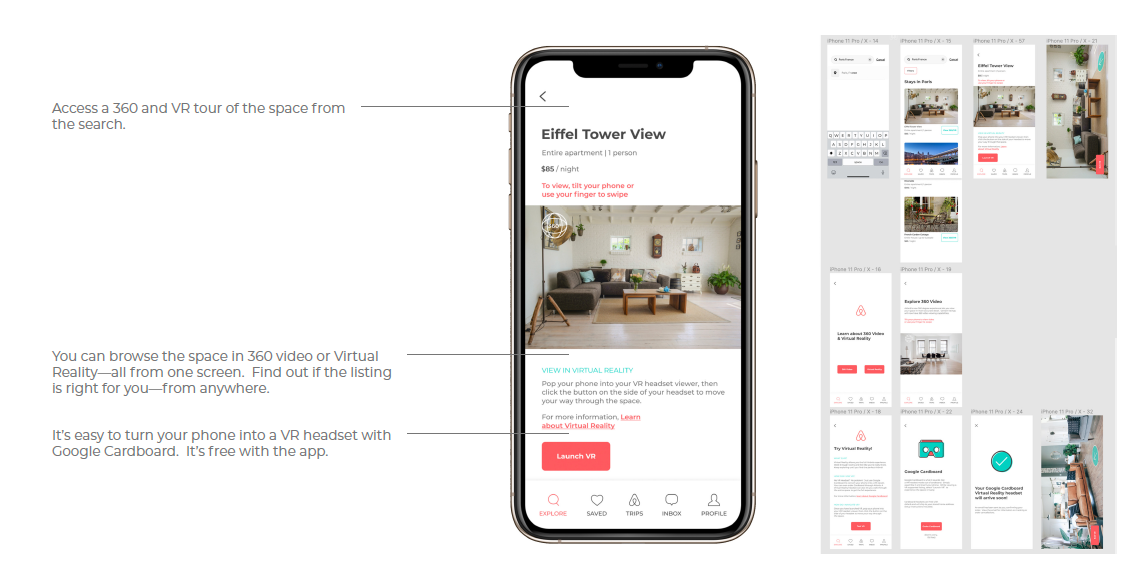
Our preliminary designs helped us test the best app screen layouts and finalize the color scheme. This exploration was also useful for identifying and correcting flaws in button size and placement. We got feedback on these visual designs, which helped to decide the final direction. We decided to stay with the coral color scheme, based on feedback. From the experimentation with the door locks screen, we decided to incorporate teal into the color palette to update the app’s brand. Pictured below are some of my VR screen preliminary designs.
Testing & Analysis
Next, we tested our low-fi prototype. Several key findings emerged:
A need for reducing the complexity of the door locks screen
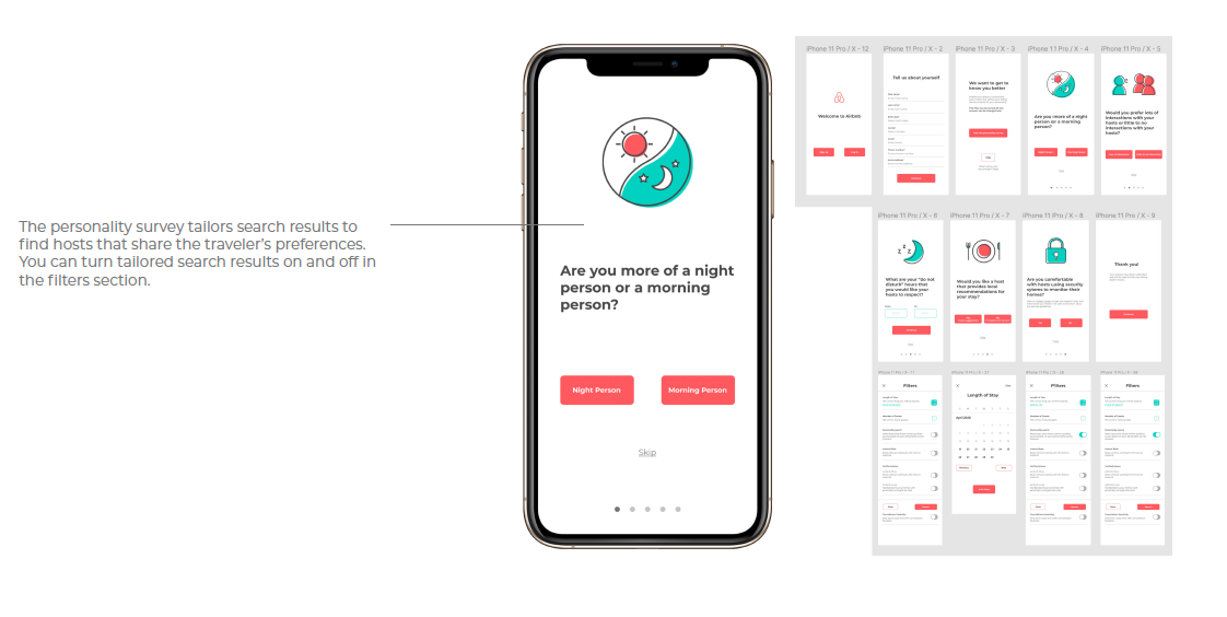
The personality survey search filter was a popular addition
The teal color could be used more throughout
A need for clarifying the differences between 3D and VR
A need for integrating the 3D and VR into one function
A need for updating the Length of Stay calendar
A need for reducing the size of the checkmark on the “Order Cardboard” screen
A need for updating the photo on the “About Cardboard” screen
A need for making the “Trips” description longer
A need for keeping consistency in title capitalization
Based on these findings, we incorporated changes into the final design to make the user flow more seamless and the layout clearer and more usable.
Outcome
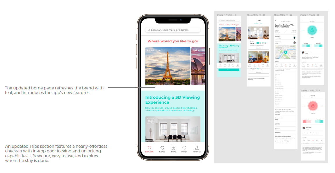
These screens highlight some of the key features of our UX design concept.
Headset Pairing
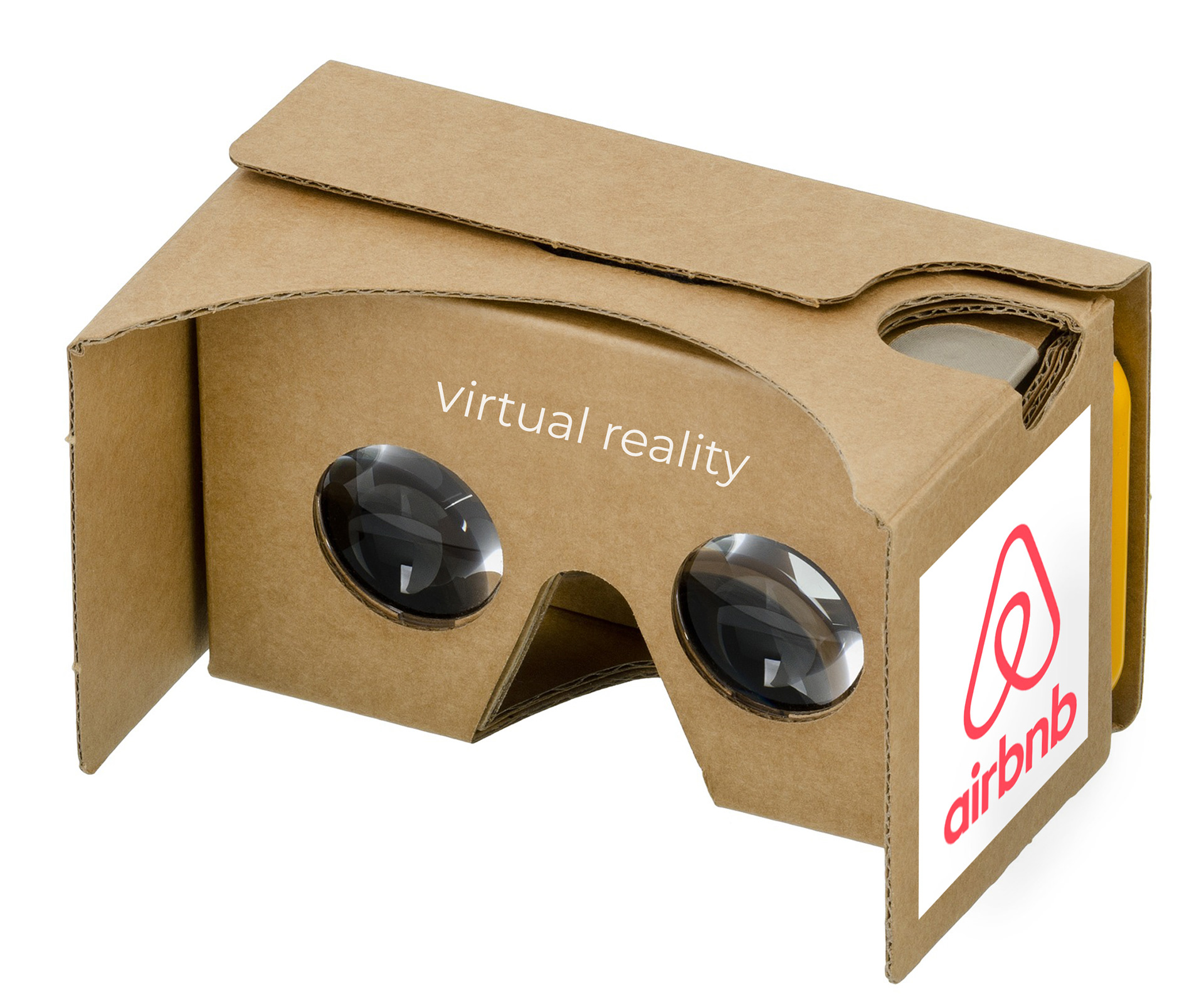
This envisioning for the app also includes pairing the app with an inexpensive 3D VR headset for a more immersive viewing experience using your phone. This is a mockup of what the VR headset would look like.
