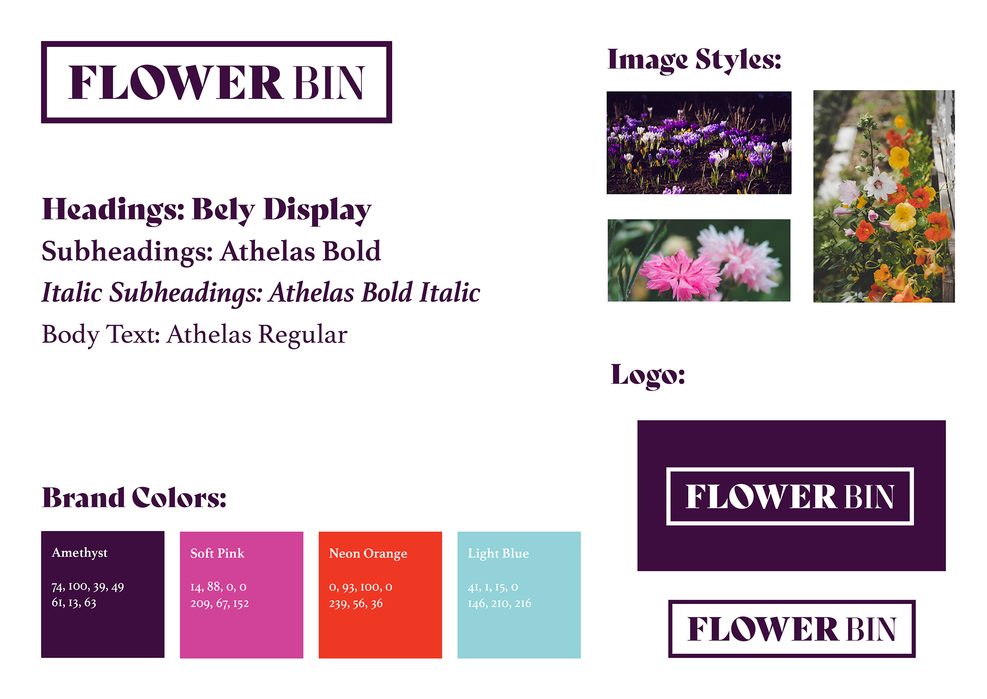
Flower Bin is a gardening subscription box that offers seeds, gardening tools, and gardening information all in one box.
The packaging goals are to create a simple design with a color palette that focuses on gardening imagery and a color palette that is similar to the garden color palette for the box.
This was the selected direction, based on the digital compositions:
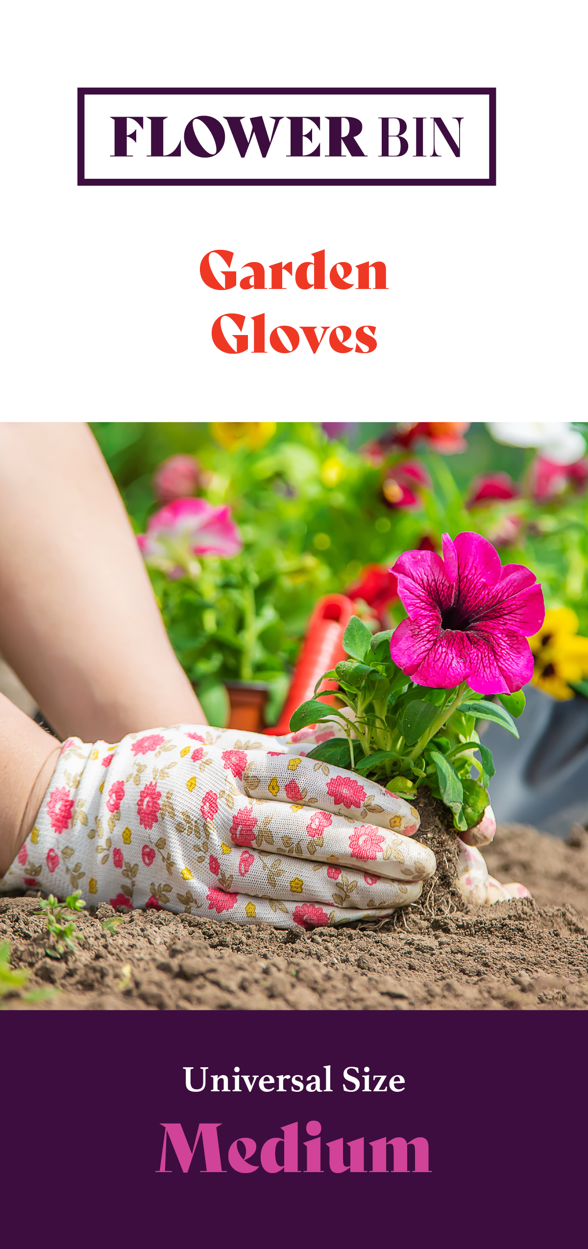
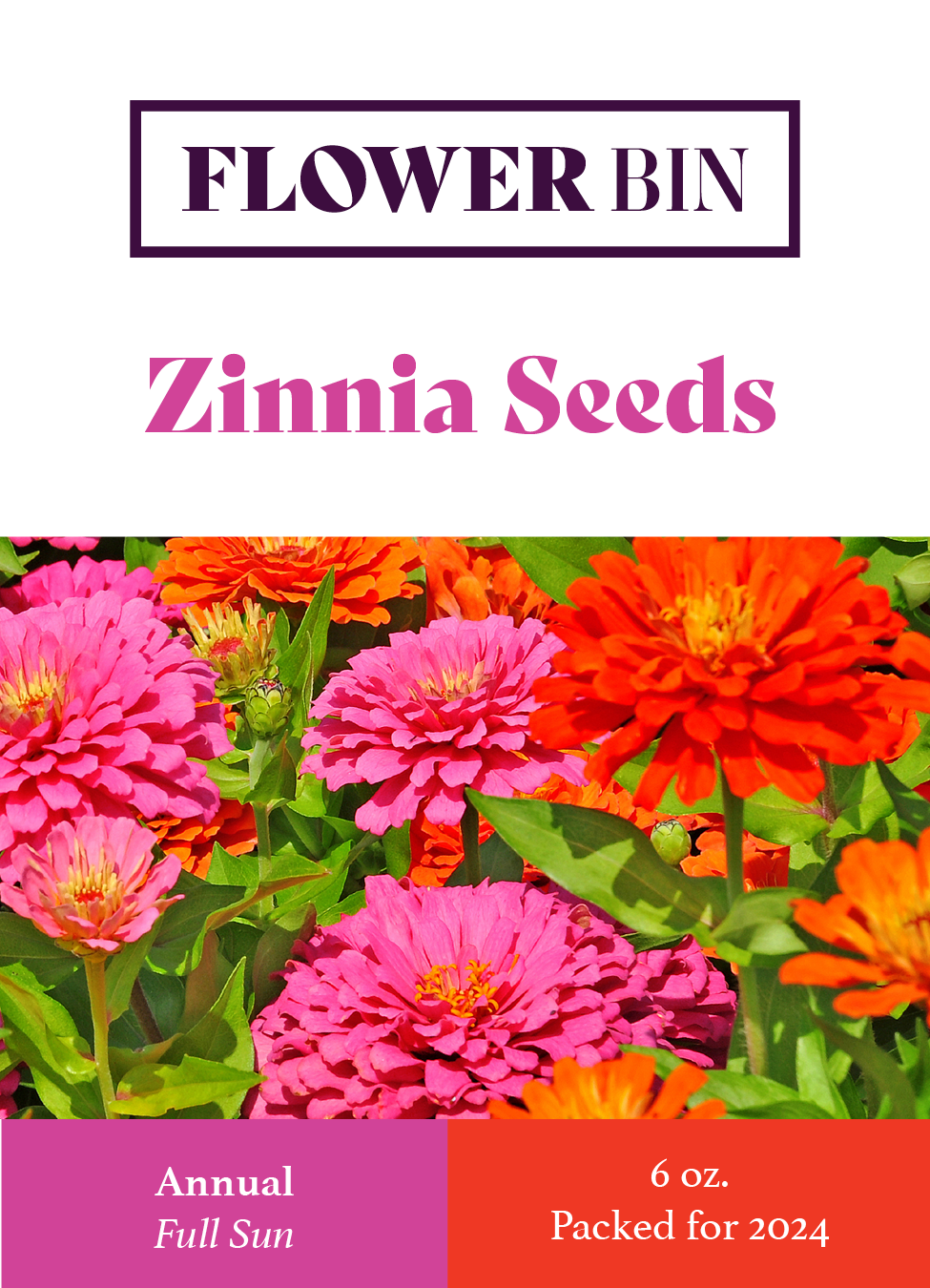
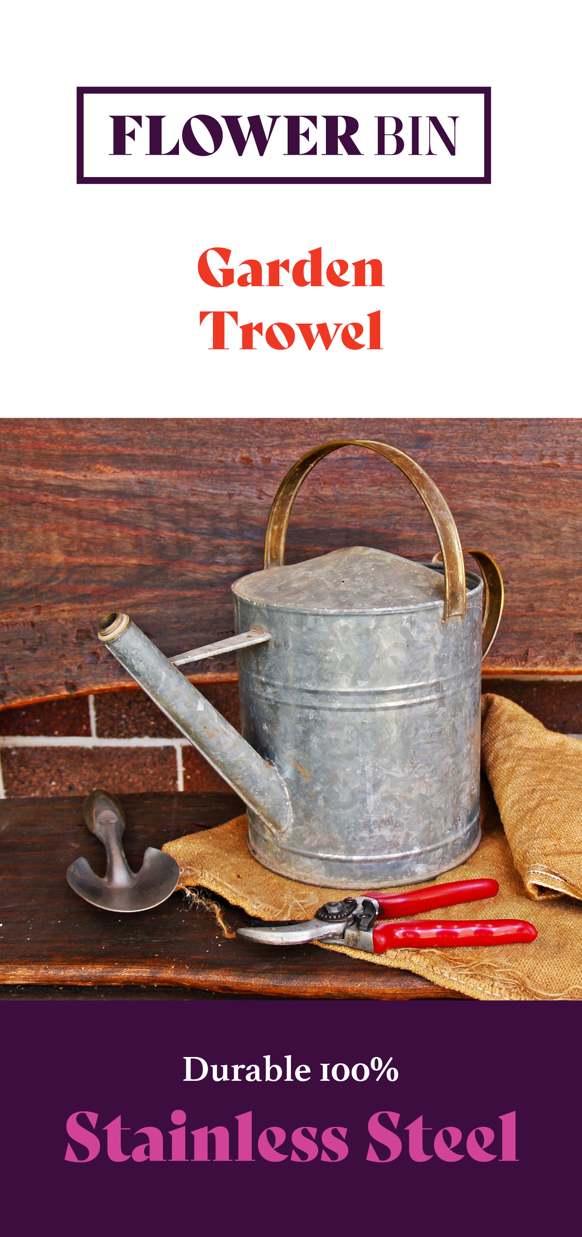
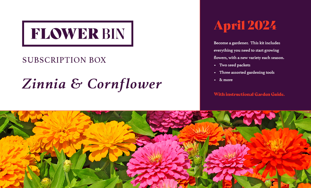
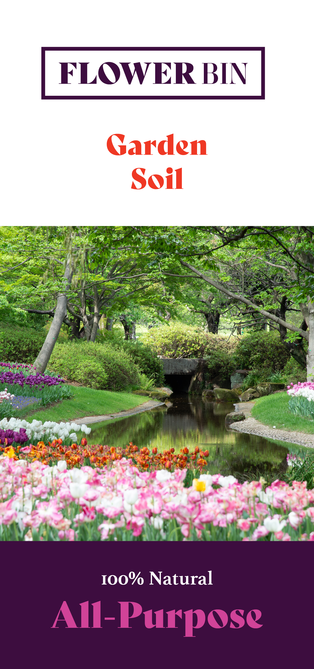
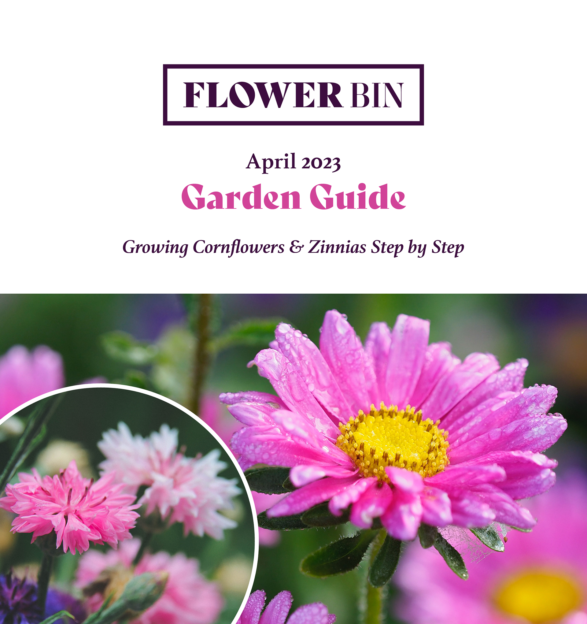
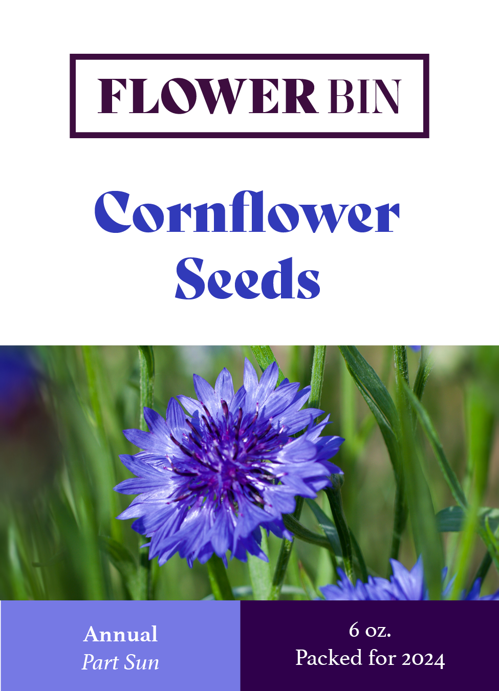
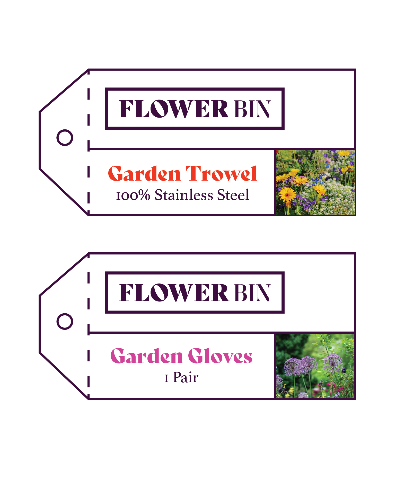
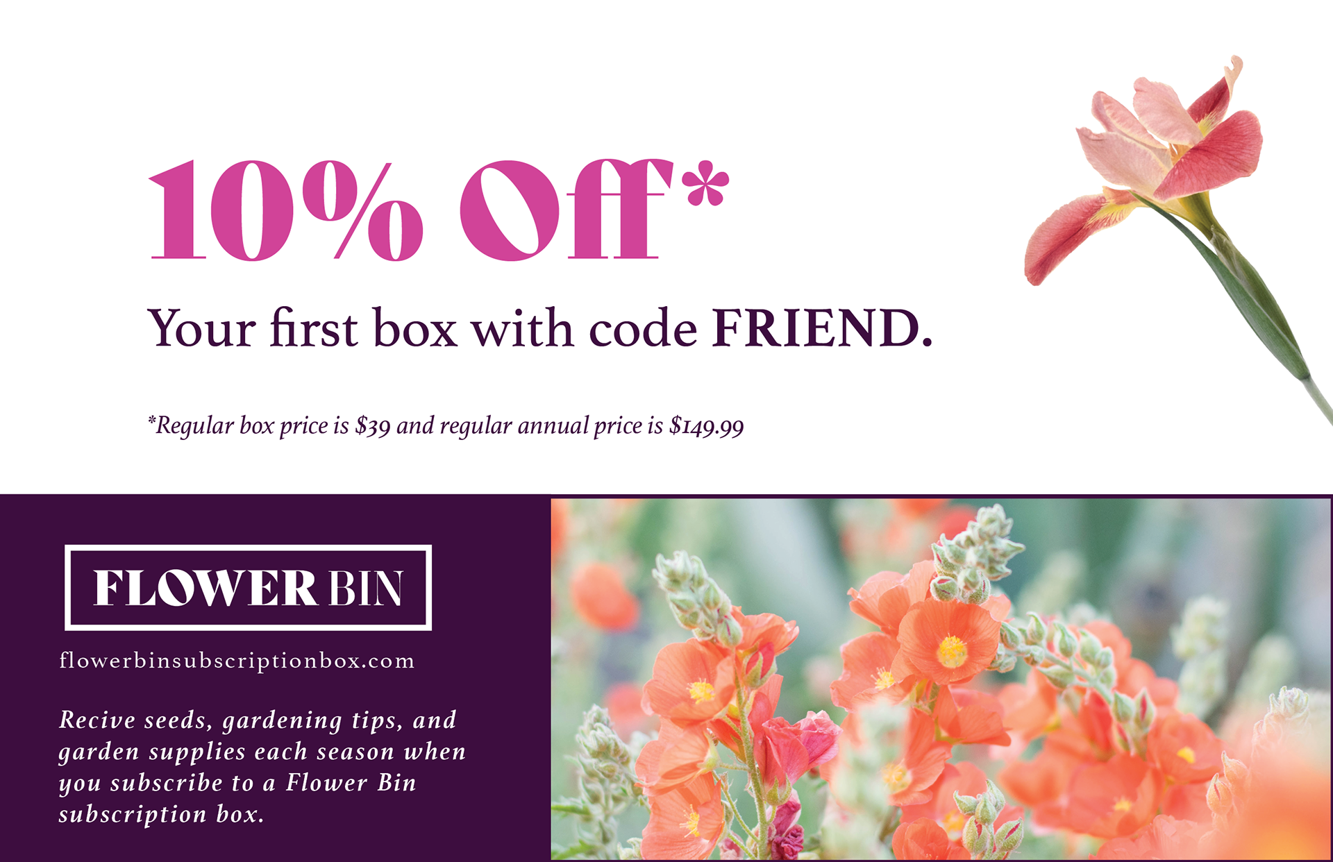
Additional printed materials for the subscription box include promotional materials including flyers and tags for merchandise.
The style guide focuses heavily on typography and imagery, since Flower Bin's layout is largely driven by photography and typography.
