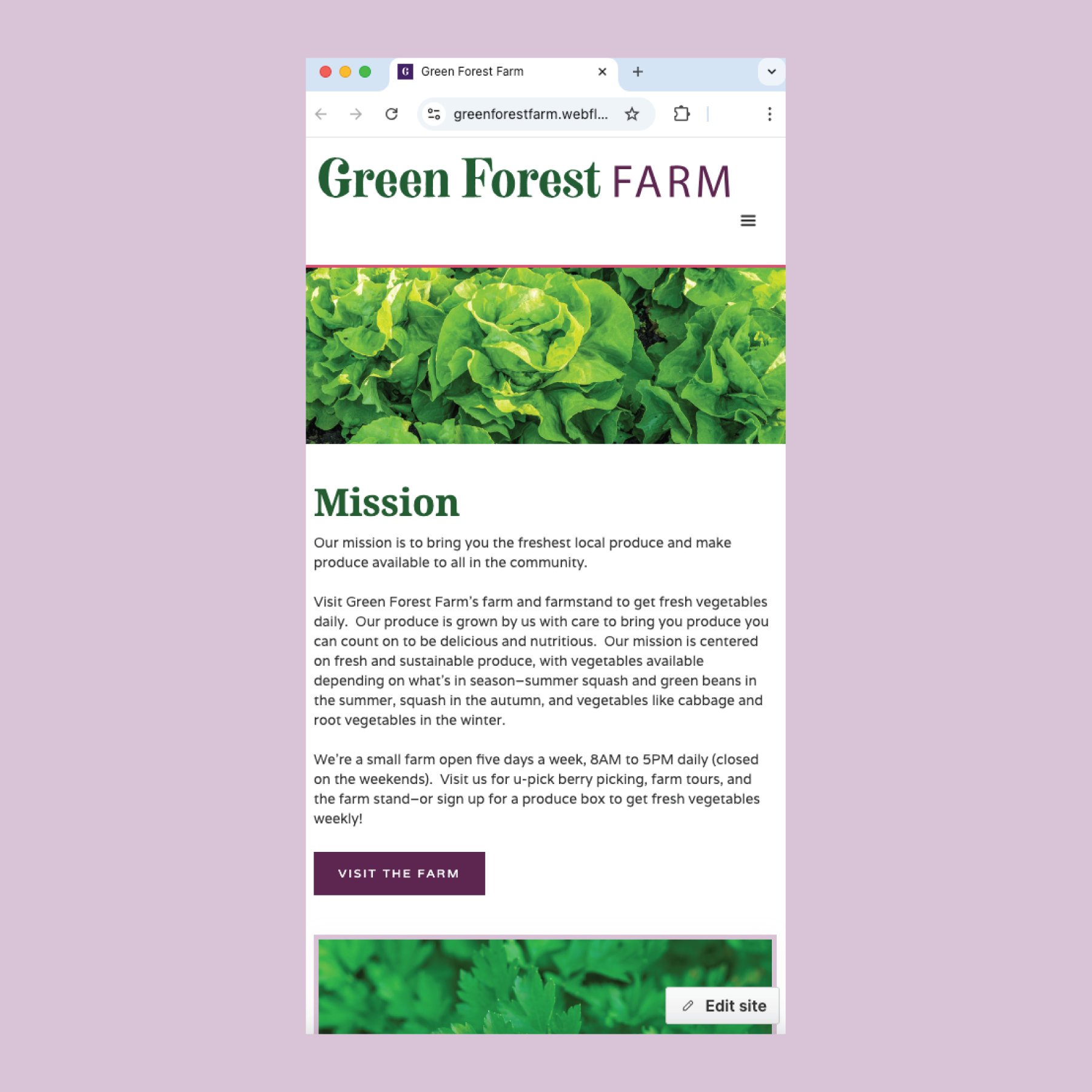
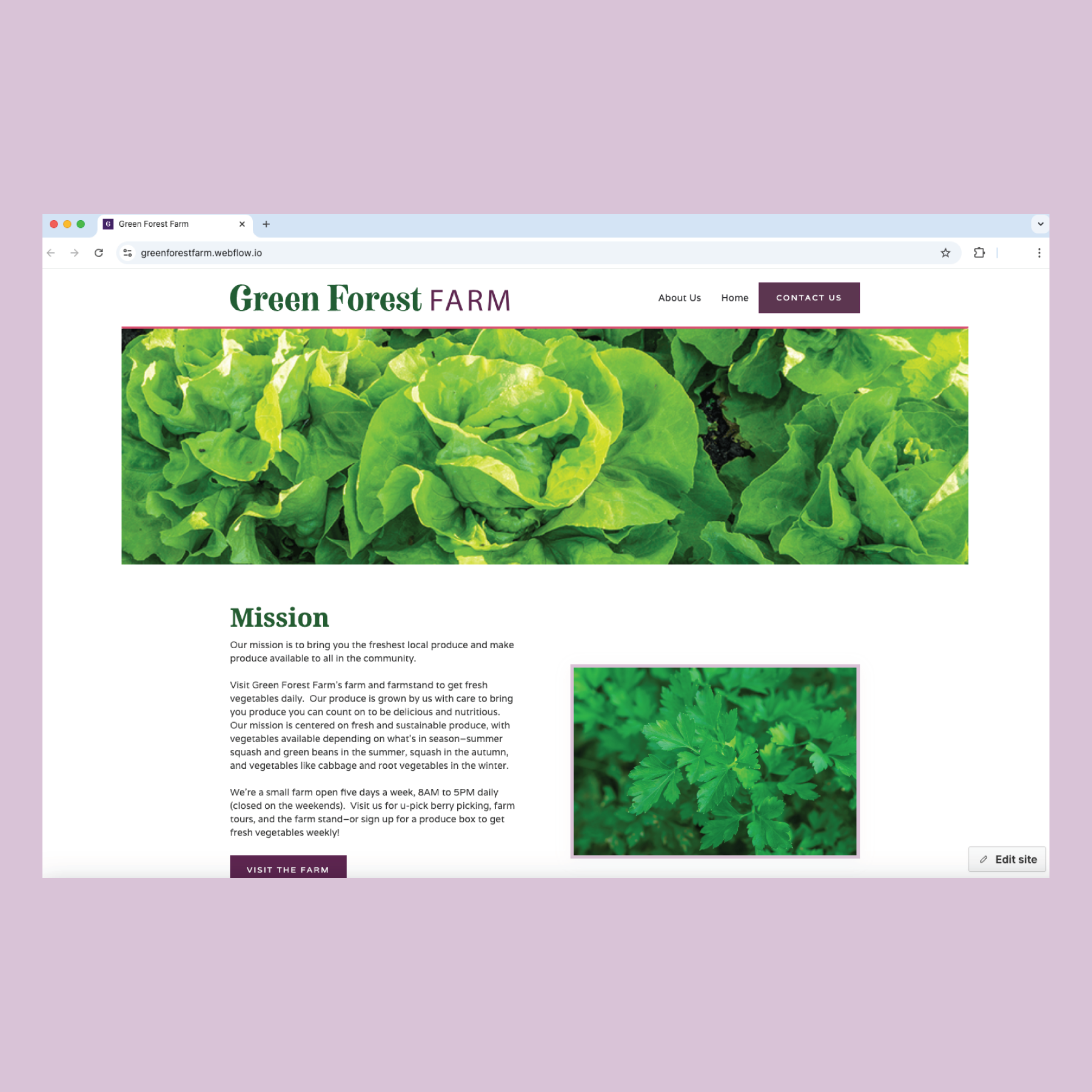
The visual design and layout focuses on the website’s goals: to exhibit fresh produce and farming with serif typography, simple layout, and a warm, inviting color palette. The design uses generous white space to focus on the photography and typography. Animations are used to bring emphasis to elements of the design. The website’s goal is to be fully responsive on any size screen including desktop, mobile, or tablet.
Figma Prototypes:
The Figma prototypes’ goal is to create an interactive version of the website designed on differently-sized screens.
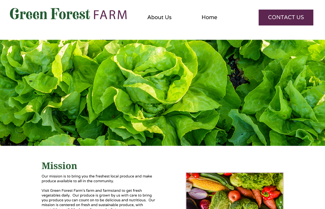

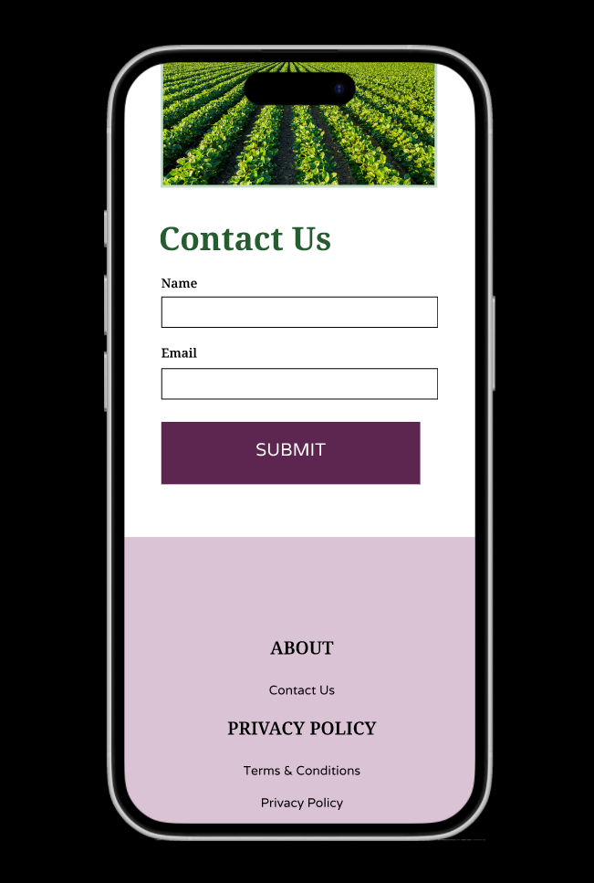
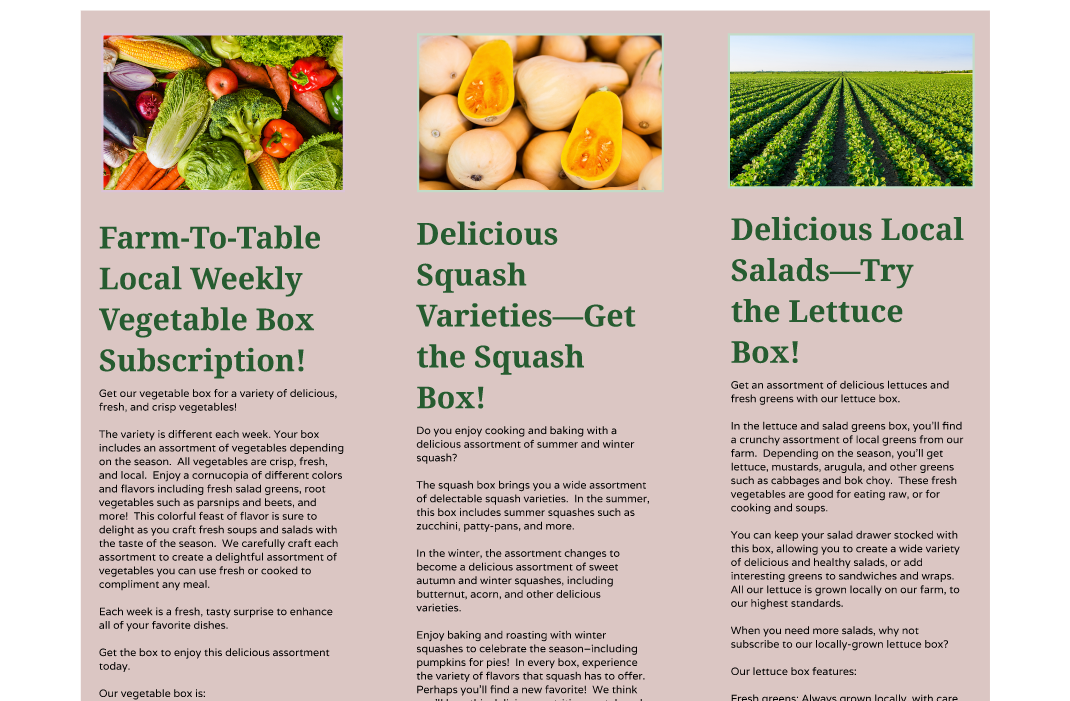
Mobile prototype: https://www.figma.com/proto/gRlVV9eMbdP516pws8de1r/Green-Forest-Farm-Prototype?node-id=11-52&t=jacEYr9ipBoNaCEf-0&scaling=scale-down&content-scaling=fixed&page-id=0%3A1&starting-point-node-id=3%3A3
Desktop prototype: https://www.figma.com/proto/gRlVV9eMbdP516pws8de1r/Green-Forest-Farm-Prototype?node-id=71-3&p=f&t=nxEDEkJGN85Uein1-0&scaling=scale-down&content-scaling=fixed&page-id=3%3A2&starting-point-node-id=71%3A3
Style Guide:
The style guide provides the basis for the design system and collects all typography and color swatches in the same place. It also describes the logotype.

Sketches and Wireframing Process:
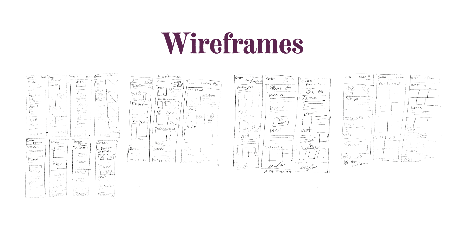
The wireframes explored ideas for the layout from quick wireframe sketches to more detailed sketches that informed the final layout and design. The purpose of the sketches and wireframes was to explore many ideas quickly.
