Project Overview
This product and UX design process focuses on TextDocuAgent, an artificial intelligence assistant to organize files on one’s device: A computer, a tablet, or a mobile phone. These are the final product images, and what follows is the process of strategy and ideation that ties the result to key business and user goals.
See the Prototype

Role
Product designer and user experience designer.
Skills Used
- Figma
- User Experience Design
- Product Design
- Typography
- Design Systems
- Ideation
- Wireframing
- Prototyping
The Problem
Users struggle with unorganized file folders and desktops on their computers.
The Question
How might we allow users to organize files seamlessly in one click?
The Solution
TextDocuAgent, an agentic artificial intelligence that runs locally on one’s computer, making use of the computer’s processor. Since TextDocuAgent runs locally and sends no data to the cloud, it is secure.
How TextDocuAgent is different: TextDocuAgent uses machine learning to learn from the user’s document organization patterns for well-organized documents and apply this same pattern to the documents it’s asked to organize. It does so through running the training data and then applying this learning to other situations. This helps save users time, organizing documents at the click of one button.
Process
The design system must speak to each of TextDocuAgent’s main functionalities, creating a custom visual language to denote these qualities.
This process uses a minimalist design process to streamline workflows, which cuts production-heavy visual artifacts from the design process. The effort goes into fully defining requirements before producing any graphics, allowing for greater focus put into the strategizing process. As you will see, this results in each element on the final prototype being tightly tied to product goals and user goals.
Product Goals
- Make the process of organizing files seamless
- Provide an intuitive user interface to users to organize files on their own computer
- Do not duplicate existing computer functionality
- Integrate with existing systems and user workflows however possible
- Create a lightweight, usable interface
- Work with the existing software environment
Functional Requirements
Please note that functional requirements are everything this prototype must do for the user. These are essential to define to understand the future user flows and necessary elements of the user interface. These elements will each be tied to a functional requirement.
- Allow users to organize files with machine learning
- Allow users to select a subset of files to organize
- Allow users to organize files by their recency
- Allow users to organize files by date and type
- Allow users to search for a specific file by a description, using machine learning to accomplish this
Non-Functional Requirements
The non-functional requirements for this prototype define its qualities that make the user interface intuitive. Defining these is important to provide a baseline for future usability decisions.
- Provide an inviting and minimalistic user interface to organize buttons
- Provide a usable search box for users to find files by descriptions
- Organize all elements of this functionality into a single window for easy searching
- Maintain a strong visual hierarchy to allow users to distinguish between different types of elements
Background research: The Product Space
How does this product fit into its expected space? A product such as this should employ the design techniques of both repetition and variation, in order to fit into user expectations. Most of the design will be repetition to fit into the norms of this design space. The variation aspect of this design is the “plot twist” that makes this product stand out and be memorable to users. It’s what makes this design system unique.
The product space for this is agentic locally-running user applications. The space also is the space of file organization and desktop computer applications. This space typically includes a lot of white space, buttons, and software windows. These norms should be followed, and the “plot twist” of the design built on top of these in order to seem familiar to users, but yet stand out. These predictable elements of the design should be built first in the basic design system, and then added to in order to create a harmonic, modular, and extensible design system.
What’s the “plot twist”? The plot twist is the agentic and locally-running nature of the software.
Some key characteristics that set this product apart include:
Being Lightweight and Minimalistic
How the design can embody these lightweight and minimalistic qualities: By using white space to make it seem lightweight, allowing ample spacing around elements. To seem minimalistic to the user, this design can employ a sans-serif typeface or a slab-serif typeface with a light weight and ample space within letter strokes. In addition, this design can use strong contrast between colors to create a light and airy feeling within the white space. Dark colors for text can further enhance this effect.
Being Agentic
The design can give the user a feeling of its agentic qualities by using bold elements for headings and the logo of the software to draw attention to these qualities. These elements should use modern typefaces to give the user an impression that the software is agentic from the branding.
Using Machine Learning
To inform users of elements that use machine learning, this design should establish a visual language to denote them. This should draw on norms in the artificial intelligence space, including using an icon to show when a button uses AI or a similar type of imagery that users expect in such iconography.
Creating Organization
This can be communicated through the visual language of the design system by using grids, regular spacing, and repeated iconography to create a tightly controlled, closed design system that communicates these qualities to users. By making the application’s design system adhere to these organizational qualities, it can promote greater confidence in users and organize the design system effectively.
All these “plot twist” items are very important, and will be incorporated into the finer points of the design system for its development. The design system builds off these requirements and qualities, and each decision is directly tied to and informed by these qualities. This provides a framework for moving forward with the visual design system.
Who Are the Users?
This is the most important part of the design: Now that the functionalities are defined, they must be tailored to the target users. My design process is lightweight and minimalistic for maximum agility, and I prefer not to produce graphics-heavy user personas, instead focusing energy on essential parts of the process that these personas represent. This process cuts out everything we know about the user in order to only focus on the aspects of users that actually affect how they interact with the software.
I prefer to use specific use cases that detail the overlap between the user’s actions and the product, because this gets to the point faster, while still understanding the user.
Portrait of the Ideal User
The main user of this software interacts with the prototype in the following cases, and as a result these are the user’s needs that need to be met:
- When the files on the user’s computer are not organized
- When the user cannot remember the name of a file and would like to find it by description
Great! There are only two cases where the user wants to use the product. This narrows down the ways in which the user needs to be understood quite a bit.
What we know about the user from these two scenarios:
- The user has files
- The user has a computer or mobile device
What this product needs to do for the user to improve the user’s experience:
- Make it easy to organize files
- Make it easy to find lost files
In this way, we can empathize with the user and understand the user’s needs in a very narrow scope to be effective.
Additional insights into the user of this application (inferred from these facts):
- The user likes to keep files tidy and organized
- The user wants to work quickly and efficiently
User Pain Points
How the user feels before using this product:
- Overwhelmed
- Disorganized
How the user should feel after interacting with this product:
- Calm
- Organized
As a result, this product’s design should promote feelings of calmness and organization on all screens, and at all steps. This can be done through creating a grid-structured, minimalistic, and uncluttered design with lots of white space for the viewer’s eyes to rest–a contrast to a messy desktop.
How might we make the product meet the user’s needs?
Since the user is disorganized, wants to be organized, and wants this to happen fast, this product needs a clean, simple interface with few buttons and it needs to execute actions quickly. There need to be clear loading indications, a clear indication of how much time is left in the process, and a clear indication that the process is done. There needs to be a last update time stamp for file organizations because our users are obviously not very organized and may not know when they last ran the operation to organize files.
How can the iconography and button design support these needs of the user? This helps determine the potential footprint of the prototype.
- Search for a file by description
- Train on a subset of organized files selected by the user to organize a subset of future files
- Select a subset of files to organize
- Organize all files
- Organize files by recency
- Organize files by date and type
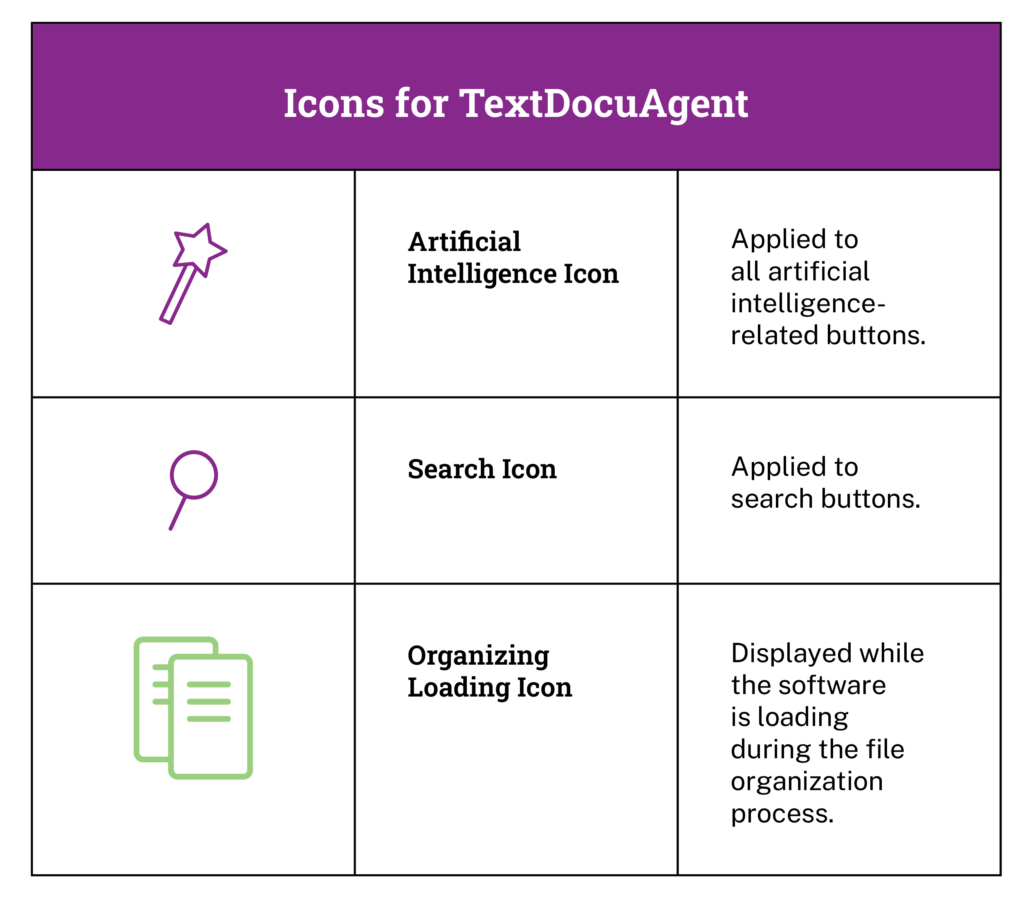
The icons should be clear and follow the simple, clean design system of the application. The artificial intelligence icons should follow industry norms. The file finder should use a standard magnifying glass icon to denote a search, in order to follow what users expect and let them find the search very quickly.
There should be no other icons, because there are no reasons to include other icons. We also need loading animations for document organization and training. Any additional icons would not support the needs and goals of the product or the user.
The following are the icon design language that were developed to support these user and business needs:
How can button design support the user’s needs?
The buttons must be high contrast and clearly denoted to be found quickly. There must be a clear “clicked” state that lets the user know that an action has been successfully requested. The buttons can all follow the same design language, since icons are being used to denote the search element and artificial intelligence elements.
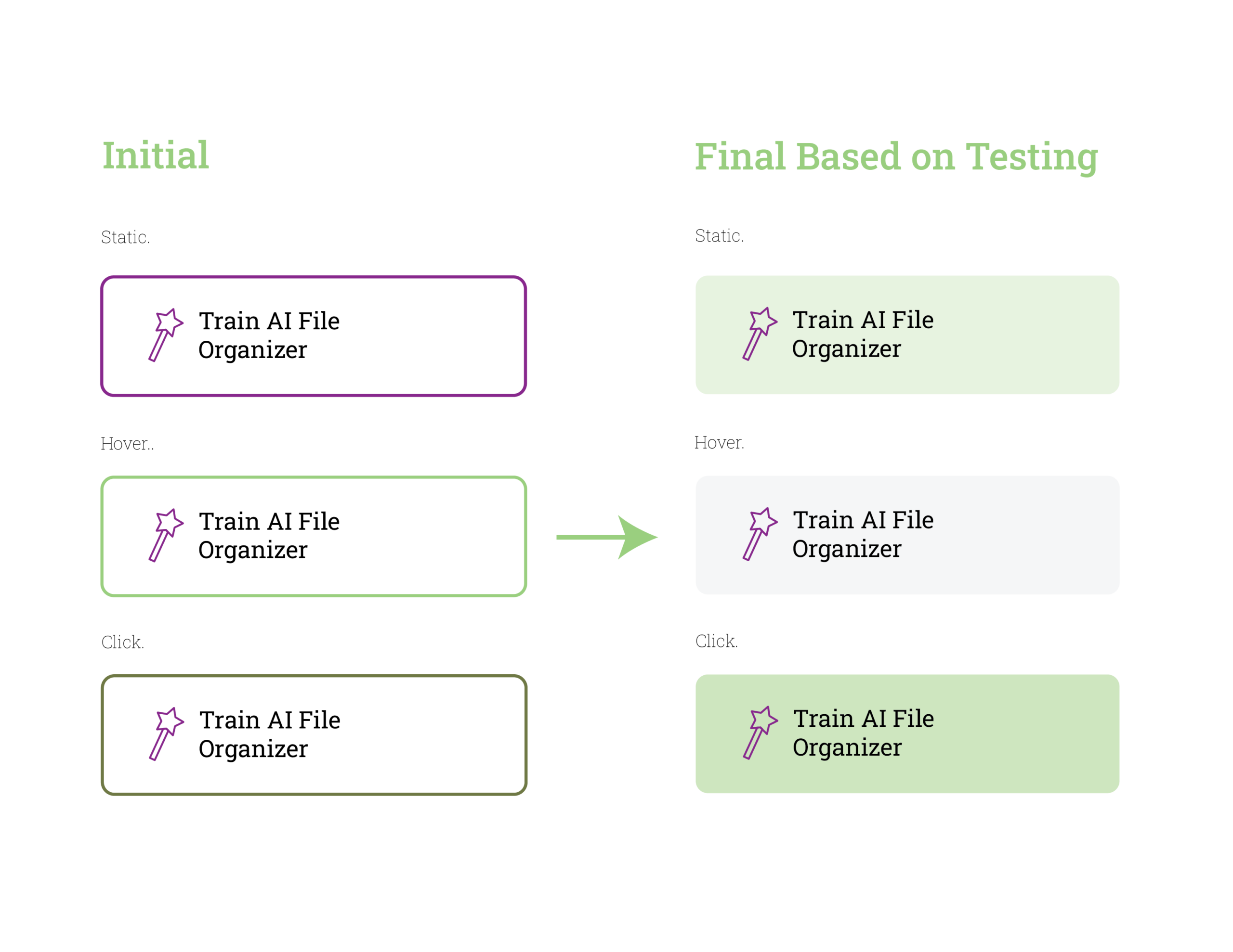
The button design went through changes during prototyping: An initial “hypothesis” state to a final “user tested done” state. These are the button iterations, followed by the final design:
The hypothesis: “Bold button outlines stand out!” There should be strongly colored outline with a white button center.
Result based on testing: More muted solid tones achieve greater harmony with the desired look and feel of the product and easier button identification.
Where should the TextDocuAgent logo be placed?
The TextDocuAgent logo should be placed at the top of the screen, to follow the industry standard for desktop applications, as mentioned earlier in this research. The “plot twist” is the unique design of the TextDocuAgent logo, in order to make this product stand out and give it some individuality.
As you can see, by considering industry norms, what makes the product unique, and specific user needs only where the user and the product overlap, a clear foundation for the design system and visual language are being built. Each step introduces rules and reduces choices, which are both essential for the process of creating a product.
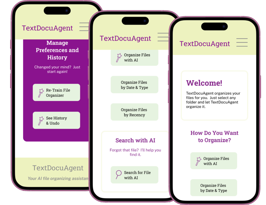
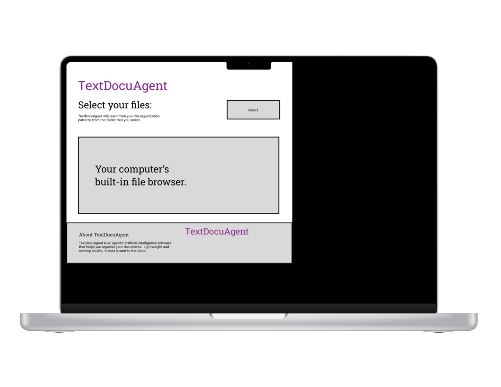
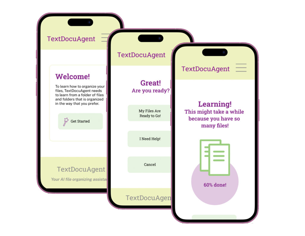
The Decision: The Prototype
For demonstration of the design process, from this point forward, I will be working with a subset of the product: One user flow to bring this aspect of the product into high fidelity with a prototype. The techniques from this process can easily be applied to other areas of the product to bring it into full fidelity, in order to achieve a working prototype because the design system is both extensible and flexible, and all user flows have been defined.
The User Flow
I chose one user flow to prototype: The user flow from onboarding through training the artificial intelligence on a set of files. This assumes that the user has already created an account and logged in and focuses on getting the application set up and using the application.
How would the user interact with the product to achieve each of these goals?
User flows are extremely important for this situation because this product has multiple functionalities, and the user flows can figure out exactly how many situations are involved in each process. It is essential to define these before producing the prototype.
User flows denote every possible way in which the user could interact with the prototype. However, this project will only focus on one.
The following is a representation of the entire user flow, and the aspects of it that were focused on and prototyped.
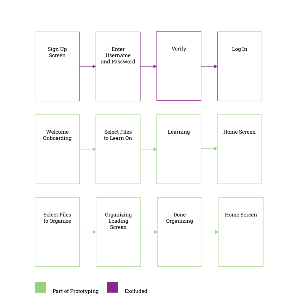
From now on, for proof of concept, this development process will focus on applying the modular design system to one user flow through the application: User onboarding through organizing the files with artificial intelligence. This key user flow lies at the core of the application.
Wireframing
I created wireframes to ideate on screen layouts. This is one step that I like to keep open-ended, because the first idea is always overly simplistic and insufficient; it’s important to get past the first idea. How many thumbnailing wireframe iterations it will take to get to a final satisfactory result that is usable and meets product and user goals as a starting point is undefined. That’s why this process is open-ended with a large number of iterations; good ideas take some digging to get to, and they are never the first idea!
However, the potential permutations and combinations of items on the page can get quite large at this step. That’s why this process is resource-intensive to dig up good ideas but must not be so resource-intensive that it takes too long.
I created and defined the elements that need to be on each screen before wireframing, because the very purpose of wireframing is to try out different page placements of all these page elements and figure out how to organize them for maximum usability and simplicity.
It was necessary to create wireframes for the ideation step. This is because, although the constraints are pretty well in place, there is still room for investigating the ideal configurations of screens based on the user and product needs. All wireframing decisions were directly informed by these goals.
Wireframing ideation techniques:
Quick idea generation: Generate as many ideas as possible in the span of eight minutes. Pause and repeat.
Low-fidelity wireframes (paper prototyping).
To establish a baseline for the low-fidelity prototype, “paper prototyping” via paper wireframes is an effective method. It really helps to get a feel for the user flows and the layouts before going into a graphics-heavy production environment and provides a solid baseline for low-fidelity prototyping production.
I created a series of wireframes with pencil and paper to ideate on ideal screen layouts, considering usability. Particularly, it was important to keep in mind screen simplicity.
Some takeaways emerged from wireframing, as well as wire frames for initial computer composition layouts:
- To achieve screen simplicity, it was necessary to group similar buttons by each other. This makes use of the proximity and gestalt principles for greatest usability. This made it more intuitive and reduced visual screen clutter.
- Separating the AI training section from the rest of the screen via a visual delimiter helped achieve clarity. As a result, this section appears in a separate portion of the screen.
This is the purpose of ideation and wireframes for this project: To reduce options and create an effective starting point for screen layouts. In this process, it also digs up the necessity for additional specifics and groupings and layouts that need to be changed for usability. In this way, the wireframing process was successful.
I won’t bore the reader with scans of stacks of messy pencil-sketched wireframes, because this process needs to be messy and chaotic in order to generate new ideas. If you try to edit while you create, you cannot generate new and relevant ideas.
If you try to make this step look clean, organized, and professional, it loses its purpose. Looking clean and polished is the purpose of the next step: The low-fidelity prototype for user testing. Wireframing ideation is the ugly, messy brainstorming process that stands behind a polished design (invisibly, of course). In the low-fidelity prototype, the editor mindset can start to step in to start moving toward the finished, final product.
Prototyping: An Essential Step of the Process
The next step went into Figma to create a low-fidelity prototype based on the ideation sketch wireframes and the user flow. This was used for user testing to uncover additional usability issues. It established layout specifics and functionality specifics but did not yet apply the design system and branding elements.
This low-fidelity prototype only prototypes the actions the user needs to take on the screens to achieve this user flow. Although there are other actions on these screens that users could take, and could be simulated, this process focuses only on this user flow and only makes the actions within the user flow interactive.
The low-fidelity prototype differed slightly from the wireframes because to implement this functionality fully, additional buttons and actions were needed.
Testing the low-fidelity prototype revealed several insights. First, it was clear that the aspect ratio of the prototype was not working for usability. Second, the buttons on the screens needed to be grouped differently because they were overwhelming on the screen. Third, the explanations were too technical, and they needed to be friendlier and more accessible.
Bringing the low-fidelity prototype into mid-fidelity by applying the first iteration of the (non-final) visual design system was a valuable tool for identifying improvements to both the prototype and the design system. This helped identify ways in which to make the buttons more effective, refine the color scheme, and modify the typography rules. This was an extremely valuable testing step for finding and identifying design system problems!
Next, after refining the design system, I created a secondary mid-fidelity prototype. This solidified the need for a different mobile-first layout and different groupings of buttons, as well as additional refinements to the design system. Testing also revealed the need for modifications to the onboarding process to make it more intuitive and user-friendly.
This resulted in a return to wireframes and sketching for the layouts and an updated high-fidelity prototype with an updated aspect ratio, a more user-friendly onboarding process, and the simplification of the descriptions of technical details. The following are product images, along with the high-fidelity prototype. However, the main user flows were retained, and the potential improvements found by this prototype were incorporated into the final high-fidelity prototype. The changes mostly focused on screen placement of items and making the text descriptions more user-friendly, in addition to refining the colors of the overall design system.
The final prototype went through several iterations and testing steps based on these insights to achieve its final form.
The Design System
The design system for this product needed to be extensible, modular, and flexible, in order to apply to all environments in an efficient, harmonic, and effective way. For this design system, I used my concept of rule stacking, where the design starts with basic design rules. Next, more general custom rules are built upon that based on user goals and prototyping goals.
Finally, very granular, custom rules are built upon these to achieve specific custom rules for elements of the process, informed by user testing, including the specific designs and placements for small icons and buttons.
By stacking and defining these rules, the possible problem space is reduced with each step in a way that is consistent with business, user, and prototype goals. Most importantly, each rule is guided and defined by the rule below it, iteratively progressing towards an ideal solution in which all possibilities have been tamed in a way that meets all product and project goals. At the end of this process, a complete style guide system is produced and the level of ambiguity is reduced to as near zero as possible via this stacked process of high-quality rules and progressive refinements.
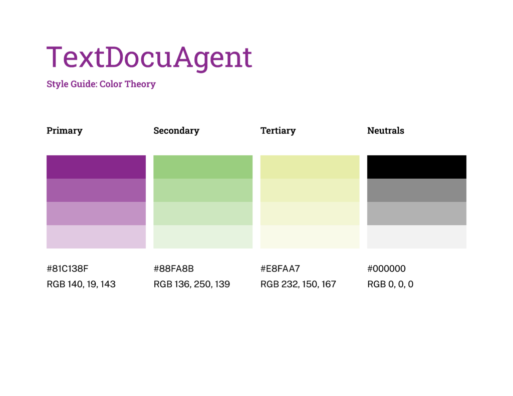
Color Theory
The first step for defining this design system was to define the color space via color theory. Color theory is useful because it provides a valuable heuristic for choosing the ideal colors for a product.
In this case, the business and prototype goals included high contrast colors with a dark color for the type to make it stand out. To start this process, I chose a base color to anchor the color wheel: A dark purple color which would meet these goals. Why? Because it offers high contrast, is viable in the desktop products and agentic space, and is dark and bold enough to use for both text and outlines. As you can see, the specific color does not matter so much as being able to meet these attributes.
This provided a solid starting point for the process, reducing possible other choices and maximizing ideation efficiency. To choose the remaining colors, I decided to employ a split-complimentary color scheme.
A split-complimentary color scheme was ideal for this process because both complementary color schemes and split-complimentary color schemes provide strong contrast. However, sometimes a complimentary color scheme can seem a little harsh to the viewer, and this design needed to be accessible and simple. As a result, I used a split complimentary color scheme as the main heuristic to soften the harshness a little bit while still maintaining contrast.
However, this was just the starting point. I used this as a starting step, before breaking it down into shades and including neutral tones to create the colors for the design system.
Defining Completeness of the Color Scheme
I also wanted to “define done”: When to stop. Without this, the color theory process can end up taking too long or having unexpected detours that increase project completion time. The process of picking the colors from the color wheel had five iterations, after which the ideal color scheme was chosen.
Why so few iterations? With the base color chosen and the color-picking heuristic in place, the rest of the colors’ specifics don’t matter so much, and five iterations allowed for choosing the combination that would support functional and non-functional requirements, product goals, and user goals in the most efficient way. After all, form follows function!
The reason for defining these rules beforehand was to decrease the possibility space and move through this step most efficiently.
Color Scheme ideation:
Base anchor color: #8C138F
Setting this base color and the heuristic for the color wheel drastically reduced the possibilities for the other colors.
This was the process of choosing the final color scheme based on these constraints:
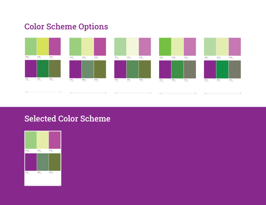
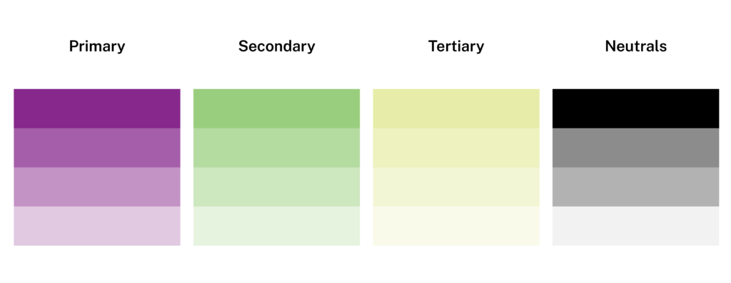
Final Color Scheme
However, the color scheme selection process was not complete yet. The next step was to choose neutral tones that could be used for the final color scheme in the style guide. Based on this, this is the final color scheme that was established:
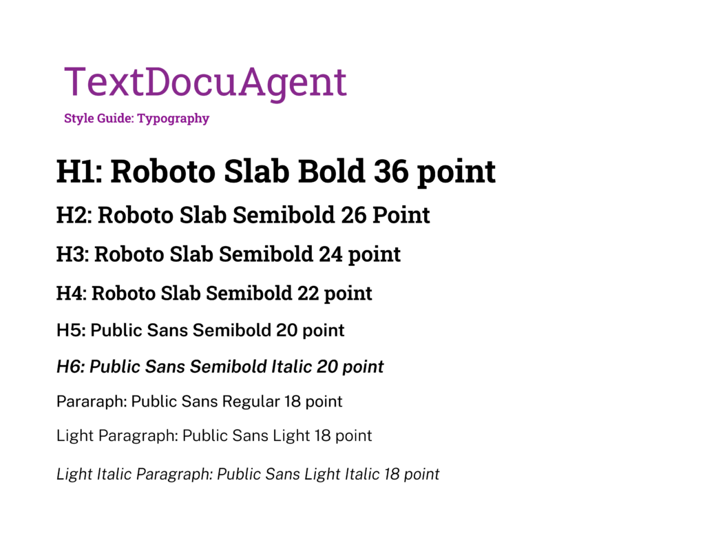
Typography
The next step was to choose and define the basic typography that would meet these product goals.
The typography needed:
- H1: Primary text
- H2: Primary text
- H3: Primary text
- H4: Primary text
- H5: Secondary text
- H6: Secondary text
- Paragraph text: Secondary text
The typography needs to fit these goals to fit product and user goals in order to achieve a high-contrast, simple, and organized look and feel to the product:
- Sans serif or slab serif for contrast
- Modern
- Multiple weights
- Low letterform contrast
- Large apertures within letterforms
- Italics available
- Large letterforms height
- Somewhat narrow in the x-width
Number of typefaces: Two separate typefaces which are a slab serif for headings and a sans-serif for lesser headings and ordinary paragraph text and complement each other. These typefaces should be able to each meet all the goals above while maintaining a tight type pairing. They should achieve repetition and variation, while still maintaining harmony and pulling together the elements of the design. The logotype is allowed to use a third, additional typeface and is not considered part of this investigation.
These constraints helped to narrow the typography search. For a further constraint, I decided to use open-source typefaces from Google Fonts in order to ensure the typefaces would be available anywhere, on all platforms and devices.
The next step was to search Google Fonts for typefaces and try different typeface pairings. How many to search? For this aspect of the product, due to these previously defined constraints, I chose to investigate five different typefaces for the main typeface. After the main typeface was chosen and defined, I chose to investigate five additional typefaces that could be chosen as pairings with the first typeface.
These five potential pairings would be sufficient for choosing a typeface that would be able to achieve the desired look and feel of this product. This limitation leans into the constraints and provides a heuristic to avoid excessive permutations, which can grow exponentially quickly, creating noise in the decision-making process.
The goal of defining these typography constraints ahead of time is to avoid these time-intensive permutations which can grow exponentially quickly as they grow in number, and use up energy unnecessarily.
Primary typeface candidates: A slab serif
- Hanuaman
- Aleo
- Roboto Slab
- Besley
- Zilla Slab
Choice: Roboto Slab
Secondary typeface candidates:
- Funnel Sans
- Mona Sans
- Public Sans
- Archivo
- Rethink Sans
Choice: Public Sans
Typeface pairing: Roboto Slab + Public Sans
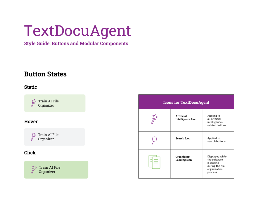
Defining Button Types
Define buttons:
- Train AI File Organizer: Select a subset of organized folders to train on.
- Search for File By Description
- Organize Files and Folders with AI: Select a group.
- Organize Files and Folders by Recency: Select a group.
- Organize Files and Folders by Date and Type: Select a group.
For iterative rule stacking, I first defined a standard button with static, hover, and click states to be used for all buttons for modular design system consistency. Then, to differentiate the artificial-intelligence-powered buttons, I added a wand icon to denote them. To denote search, the button has an additional magnifying glass icon to bring attention to the search function.
The next step to define the visual language for this product was to define the logo type and secondary icon. The logo type for this product uses a different typeface to differentiate it, a sans serif with a more friendly, agentic feel. The secondary icon provides an additional logo for the product that embodies the goals and functional and non-functional requirements for the product.
The logotype achieves harmony and simplicity through a careful typography pairing of Roboto Slab and Public Sans and combines this with an optional icon.
Style Guide and Design System
The following is the final design system that was based on research, connection to business and user goals, and testing within the environment that it would be used. The system is modular, flexible, and applicable to all product situations.
The style guide informs the flexible design system and allows the design system to adapt to new situations and applications in the future, if needed.