Project Overview
Planesphere is an interactive airport wall that aims to reduce traveler boredom in airports, offering an interactive experience that highlights the environmental impacts of air travel and allows users to interact with the touchscreen via quizzes and polls to create an engaging, interactive experience.


Role
Product designer and user experience designer.
Other Contributors
I made this project on a team in collaboration with Aubrie Rice.
My Contributions
I focused on the polls section, quiz section, logo, and case study writing. I also collaborated on other elements.
Skills Used
- Figma
- User Experience Design
- Product Design
- Typography
- Design Systems
- Ideation
- Wireframing
- Prototyping
- User Interviews
- User Testing
- User Surveys
The Project Brief
What do you get when you combine a boring airport waiting experience with education about the environment? Planesphere, an interactive wall that educates travelers on the pollution created by their trip and educates about the steps that airports are taking to cut down on emissions.
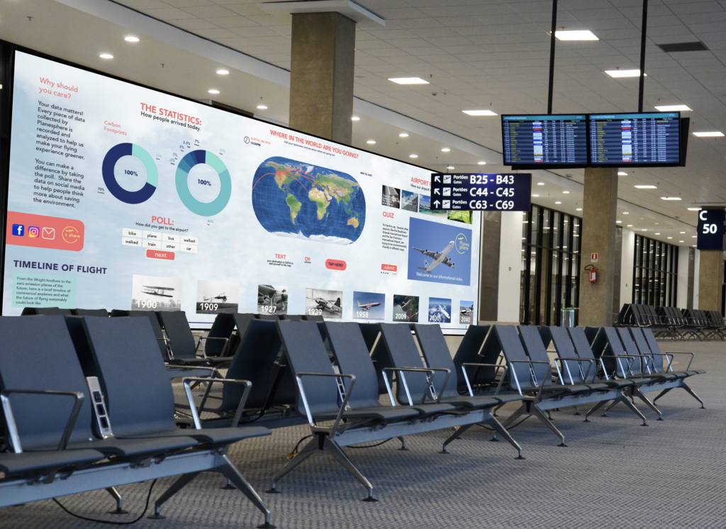
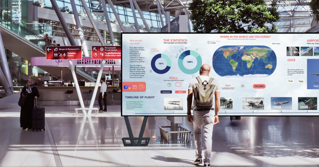
We came up with a new and fun experience in the form of an interactive wall that could be installed in airports and make people think about their impact on the environment and give them something to do during long plane wait times. This concept is shown here through a series of mockups to show users what the concept would look like in real life. For this project, we created the UX interface that would be put on an interactive wall. We took into consideration the height of the buttons, the size of elements, and the overall organization of information so people could easily interact with the wall. The wall would be flexible and able to adapt to the airport space it was installed in.
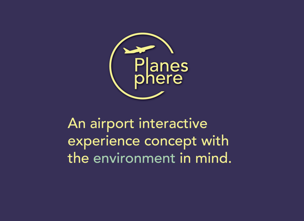
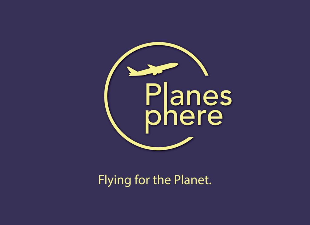
The name we came up with for this experience, “Planesphere,” represents the concept of caring for the Earth. The goal of this name was to be completely original, easy to remember, and represent the experience. The logo I designed represents the Earth, environmentalism, and airplanes and how all these experiences can be combined. This project was heavily focused on the research and process of designing the experience.
Process
The user experience design process started with competitive research, user interviews, and user surveys. Later, we used wireframes, low-fi prototypes, user testing, and high-fidelity prototypes.
Team Members and Credits
I made this project on a team with Aubrie Rice.
Aubrie Rice: Pitch video, pitch video graphics, research, designs, interviews, video narration, user flows, wireframes, mockups, video script editing, pitch.
Willow Cook: Pitch deck, video script, designs, interview, research, case study, user flows, wireframes, case study, mockups, pitch, Planesphere logo, logo animation.
In screens pictured:
Aubrie Rice: Center section of screen (with globe) design; flight timeline design.
Willow Cook: Statistics, social media sharing, and quiz screen sections designs.
Planesphere Digital Wall Dimensions
The Planesphere touchscreen wall would be three feet tall by twelve feet wide. Interactive walls should be close to the ground and not too tall, so they are accessible to the largest amount of people possible. If you have a button too far up a wall, a lot of people will not be able to reach it to use it. Another consideration was type size and contrast. If the button is too low, a lot of people might not notice it.
Based on this, we decided to keep the interactive touch and motion-detection elements on the bottom third of the screen. The type size should be large enough to read from a distance, but not too large when you get close up to it. We sized our type according to these considerations.

Framing Questions and Assumption Validation
We had many assumptions about our interactive experience and how people would respond to and use it. We consolidated these assumptions through the framing questions process–answering questions that would help us narrow the assumptions down to those that would actually be useful and relevant to the experience. At the end of the framing questions process, our top assumptions included:
- People want something useful and interesting to do while waiting for the next plane.
- While people are viewing this experience, they are in a new place.
- Technologies such as AR, video, and large TV screens could be a useful way to visualize the information.
- Our idea would work best if it both provides helpful information to travelers as well as being a source for education.
- Some people may not have a lot of time to stop and look at or interact with our product.
- People are tired and bored when they are using the space.
- Some data people want to see visualized includes how environmentally-friendly the plane and airport and, data about the surrounding area, and their environmental impact when traveling.
- In order for the space to want to be used or be accessible, it would need to be in a part of the airport that is not super busy with lots of people rushing around.
- People who enjoy traveling will be intrigued by the statistics and data visualization of all the different places where people are coming to and going from.
Survey
Next, we conducted a survey, basing the survey questions on our top hypotheses and assumptions. The survey helped to gather more data on people’s opinions and needs related to an in-airport interactive data visualization experience. Titled “Flying and the Environment,” this survey was made up of thirteen questions including demographic data, yes/no questions, and short answer questions in order to gather as much relevant data as possible. Our survey had 28 responses and gathered a wide variety of statistics.
Some of the key takeaways included:
- People prefer short experiences
- People want the educational display to have a pleasing design and clear facts
- People prefer to know about what the airport is doing to reduce its carbon footprint
Problem
People often focus on the environmental impacts of flying, but not the environmental impacts of airports themselves and individual travel choices. In addition, people often waste time while they’re waiting for a flight.
Solution
We approached the problem by first doing research on competitors, looking at technology options, and understanding the target demographic. It was important to create an experience that both visualizes fata in a new way while using new technology and is accessible and useful to people. It was also important to consider how this experience fit into an airport, where it would be placed, and how large it would be.
We approached this problem by considering, “How can we create an in-airport experience that educates and inspires?”
Pain Points & Opportunities
The first step of the design process was brainstorming. We sketched ideas. It was important to explore many ideas at this stage in order to find a result that most closely matched our vision. The takeaways from this step were that the data would need to be narrow and specific in order to create a data visualization that worked within the environment and solved an important problem.
User Interviews
Interviews were important for understanding the audience. Hearing people’s opinions directly helped inform the later steps of the design process. People wanted a short experience, and at airports they had many thoughts about food. The visualization would have to be short, simple, and interesting.
User Journey Maps
The user journey maps were essential to understanding a user’s experience in an airport. We used the journey maps to get a sense of the airport and where to put the experience. Airports are complex, and it was important to position the experience for maximal impact. In the interviews, people indicated they would prefer the experience to be simple, visible, and usable in a short time. The potential pain points that emerged were the possibility that people could be confused by the too-complicated interface and a need for transparency in data collection so people would feel comfortable sharing.
Competitive Analysis
We conducted competitive analysis to better understand the industry and its conventions. This helped to understand the context.
Comparison Matrix
We created a comparison matrix to analyze what features might need to be included in this experience. This also helped understand the background context for the user experience and product design.
Interactive Wall Research
We conducted research on the different ways in which interactive walls can be made, as well as the ideal dimensions of the experience. The ideal, to create maximum usability, was found to be 3 feet by 7 feet, in order to allow ample screen space and be accessible and usable to all types of users. This created the canvas for our design by providing the required dimensions.
Framing Questions and Assumption Validation
We had many assumptions about our interactive experience and how people would use it. We consolidated these assumptions throughout the framing questions process, answering questions that would help us narrow down the assumptions to the useful ones. Some top assumptions included:
- People want something useful and interesting to do while waiting for the next plane.
- While people are viewing this experience, they are in a new place.
- Technologies such as AR, VR, video and large TV screens could be a useful way to visualize the information.
- Some people may not have a lot of time to stop and look at or interact with our product.
- Some data people want to see visualized includes how environmentally-friendly the plane and airport are, data about the surrounding areas, and their environmental impact while traveling.
- In order for the space to want to be used or accessible, it would need to be in a part of the airport that was not super busy with lots of people rushing around.
- People who enjoy traveling will be intrigued by the statistics and data visualization of all the different places where people are coming to and going from.
User Surveys
Next, we created a survey based on our top hypotheses and assumptions. The survey helped gather more data on people’s needs and opinions related to an interactive data visualization experience. Titled “Flying and the Environment,” the survey was made up of thirteen questions including demographic data, yes/no questions, and short answer questions. Our survey had 28 responses and gathered a wide variety of statistics.
Key Survey Takeaways
- People prefer short experiences
- People want the educational display to have a pleasing design and clear facts
- People want to know what the airport is doing the reduce its carbon footprint
“How Might We?” Questions
Another step to validate assumptions was using “How might we?” questions. These helped narrow the focus and make sure the answers and solutions were addresseing relevant question that were built off of responses in the survey, interviews, competetive analysis, and comparison matrix. These are a few of the questions:
- How might we create something useful and interesting to do while you’re waiting for a plane?
- How might we use new screen-wall technologies, AR, and VR for our purpose of education and interaction so the experience is easy to use and accessible?
- How might we let people share their experiences in a safe anonymous way?
- How might we show statistics of where people are traveling?
- How might we make the experience unique to a specific airport?
- How might we ensure the experience is not too long, and is effective at presenting the data?
- How might we familiarize people with this new place by presenting relevant airport statistics?
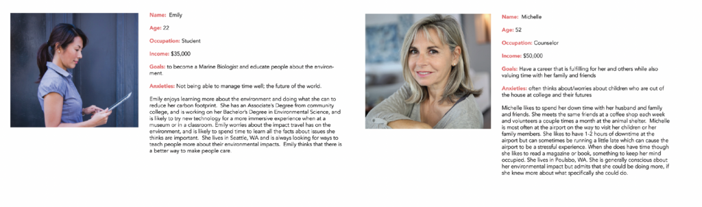
Target Audience and User Personas
Our target audience was all people who visit airports and want something to do while they’re waiting. We created several target audience personas, based on survey results and some of our previous research, to embody the most likely users of our data visualization. We chose our target audience based on our previous research. These user personas helped us narrow our target audience and understand who they were and how they might use our data visualization.
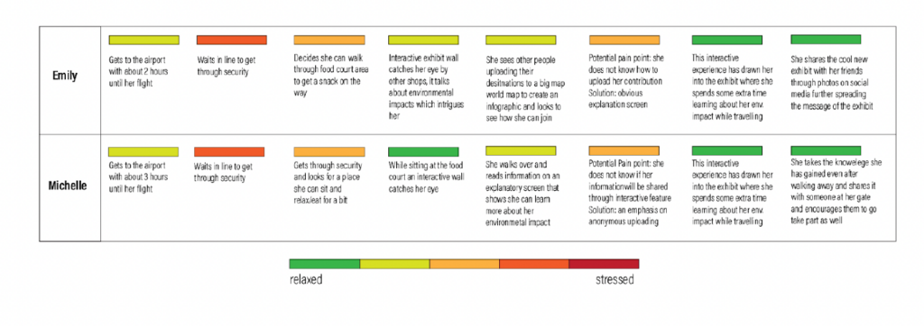
User Persona Experiences
We put our user personas in a hypothetical experience and tried to extrapolate how they would interact with the experience.
Michelle: Michelle spots the Planesphere interactive wall while she’s in the food court area. It has caught her eye and she walks over to read more about the best ways she can travel to and from the airport with a mininal carbon footprint. She decides she will take the light rail next time.
Emily: Emily walks into the airport and stands in line for security. She sets her luggage down and sees a large interactive all, and spends time studying the fascinating information on the future of green air travel. The data visualization aspect that shows people’s destinations initially caught her eye and she texts her destination to the code to see if it added to the cool infographic showing all of the many destinations around the world travelers are going to.
Joe: Joe gets to the airport really early and decided to spend time sitting on a bench and reading on his phone because he has flying anxiety. Before he can pull his phone out of his pocket, he sees Planesphere, a large was covered in data. It’s more interesting than his phone, even though he’s not particularly interested in saving the environment.
Product Statement
Planesphere is an interactive experience for flyers which educates and provides information specific to that airport’s environmental efforts and the future of green travel everywhere by showing data, research, and actionable tips for travelers to fly with the planet in mind.
Naming
We spent time brainstorming the name for our interactive data visualization experience. The name needed to be original and not in use for a similar experience, memorable and represent something about the experience. The final chosen name was “Planesphere,” with the tagline of “Flying for the Planet.”
Business Goals
- Inspire airlines and their customers to act sustainably
- Promote the growth of new sustainable technologies in airports
- To educate people about the environmental aspects of travel and the environment in general
- The product should promote the efforts that the specific airport is doing to be sustainable
- To not discourage people from traveling on airplanes
Brand Goals
- The brand of the product should communicate education and actionable solutions
- Should be encouraging, supporting travel and the future of travel in a sustainable way
- To present reliable information in an easy-to-understand way
- To incorporate new technology and ideas into the experience
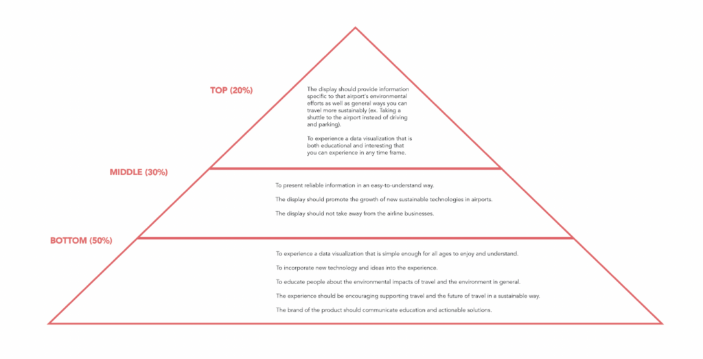
User Goals
- To experience a data visualization that is both educational and interesting
- To experience a data visualization that is simple enough for all ages to enjoy and understand
- To view the experience in any time frame, no matter how small
- The display should provide information specific to that airport’s environmental efforts as well as general ways you can travel more comfortably (ex. taking a shuttle to the airport instead of driving and parking)
Priority Pyramid
We then prioritized our goals to know which were the most important, somewhat important, and the least important.
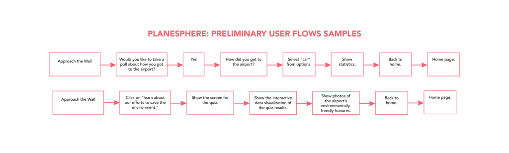
Preliminary User Flows
We created several user flows to map out the features of the touchscreen. These user flows provided rough layouts of what the features of Planesphere would be.
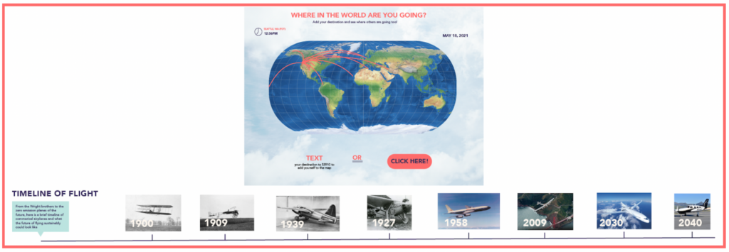
Wireframes
Our preliminary wireframes for the design helped lay out the concept and create a low-resolution preliminary design. These are updated wireframes that have been brought into a higher fidelity for demonstration and clarity purposes.
Preliminary Visual Designs
We created some of our first design concepts in Figma to test them for both design and usability.
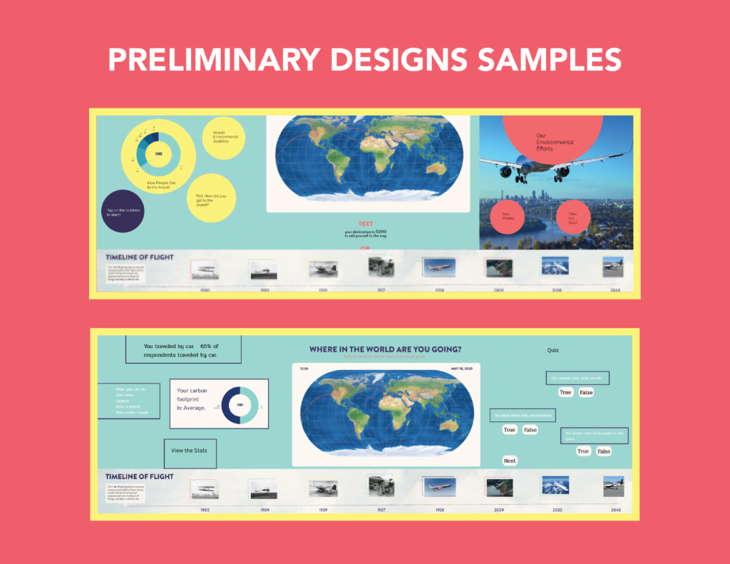
Design Testing & Analysis
We got a lot of feedback on these preliminary designs. One of the most important pieces of feedback was that the quiz and poll sections should be more unified with the rest of the compisition. People thought the clouds background added interest to the background, without competing with the foreground with colors that were too bright and saturated. Based on deedback, we decided to change the typeface and standardize it to Avenir Black and Avenir Book.
From the usability tests, several patterns became apparent:
- Users wanted the experience to be more integrated into one screen and not seperated
- Users said there should be a better explanation of why the data is important
- Users wanted to feel like the data they entered mattered
- Users were concerned about the data entry steps; they might be too slow and cumbersome
The biggest “pain points” were:
- Quantity of content
- Overall layout/structure/hierarchy
- Level of emotional design
However, people who tested the prototype consistently said the usability was good, the content made sense, and the navigation and buttons were clear.
Refined Designs
For this design step, we added more details to the designs. We made changes based on the feedback from the first round of user testing and design review. We received extensive feedback on these designs, which was incorporated into the final design and layout revisions.
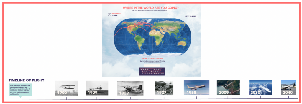

Some top takeaways included:
- There were too many boxes on the poll and quiz screens
- Some of the buttons on the map screen were too large or too small
- The text sizes could be standardized
- The styles should be unified across all of the screens
- For greater usability, some of the buttons and the features could be eliminated
- The color palette could be condensed to fewer colors for greater cohesiveness
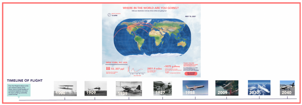
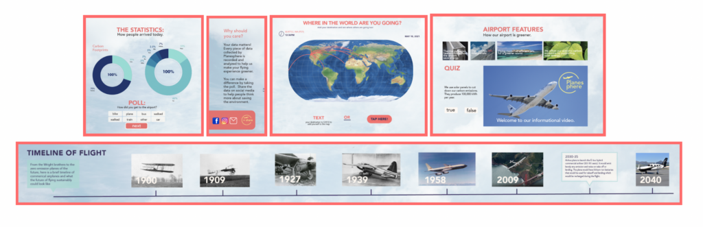
Final Design Revisions
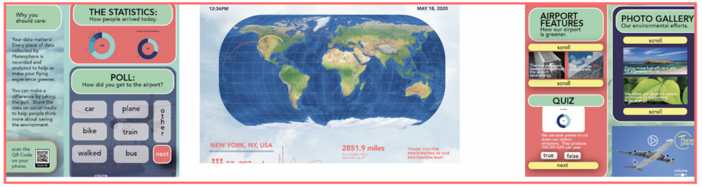
We went through another design process to finalize the designs for the prototypes and mockups. This design took into account all of the ideas mentioned in the critiques, as well and making the type sizes and style more consistent throughout. At this point, we combined the designs into one interactive screen!
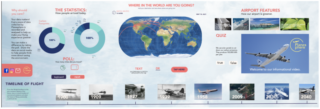
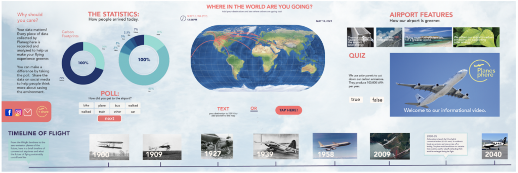
Design Features
Planesphere has many interactive features! Just tap on part of the screen to take a quiz, take a poll, watch a video, or learn about the future and history of flight! Planesphere is customized to each airport it’s installed in, featuring data about the space you’re in.
If you don’t want to touch the screen, you can use its voice-recognition and motion-sensing technology to interact. All these features allow Planesphere to create a new and innovative experience!
Vision and Future Goals
Planesphere uses the technology of today to create an experience for tomorrow and beyond. As technology advances, Planesphere would grow and change as well. Our project envisions Planespheres that are in only a few of the world’s airports, but what if Planesphere was installed in every airport? People could fly from airport to airport, learning about each airport’s statistics whern they were there. Planesphere’s goal is to inform people and airports about environmental impacts and inspire them to change for the better. Perhaps Planesphere could create a “green airport” standard. In this way, it could change the world,
The design is shown here through a series of mockups.