Process Overview
This process focuses on both creating an application to solve a problem and solving the problems within the user flow, which focus on information architecture and the problem of how you manage many options on the same screen.
InspirationallyQuoted is an app that creates custom motivational reminders tailored to the user, at specified time intervals or a one-time notification. The goal is to create reminders that encourage users to persist on difficult tasks as a positive reminder.
See the Prototype
Role
Product designer and user experience designer.
Skills Used
- Figma
- User Experience Design
- Product Design
- Typography
- Design Systems
- Ideation
- Wireframing
- Prototyping
Goal
The goal of this user experience design process is to be a positive influence in users’ lives helping inspire them to take positive action.
The Problem
The problem this user experience design research and process aims to solve is the problem of getting these custom reminders to users in a way that is user-friendly, helpful, and easy to understand. Since the main goal of this application is to create a timely, relevant, and helpful message at the correct time, this process should be focused on solving this problem.
The Solution
The solution to this problem is to create an application that can serve as a user-friendly space and “container” to create these messages.
Business, Brand, and User Goals
Business goals:
- To create a user-friendly experience that users keep using.
- To create a frictionless onboarding experience so users feel comfortable using the application.
- To be able to create an application that could scale in the future in order to meet user needs.
The brand goals provided an important foundation for the design system, since the design system works heavily with both brand goals and the visual language.
Brand goals:
- To create a look that is reminiscent of journals and scrapbooks to give the inspirational quote feel, and yet modern.
- To create an application that is user-friendly and minimalistic to focus on key important aspects of the application.
- To create a friendly and rustic look to the branding.
- To create a design system that is both consistent and cohesive across all screens.
User Goals:
- Accomplish the task of setting an inspirational reminder efficiently and quickly.
- To avoid confusion when accomplishing these tasks.
- To be able to navigate throughout the application quickly and confidently.
- To never feel lost in the application’s navigation.
- To be able to log in to the application quickly and relatively effortlessly.
Overall, these business, brand, and user goals are important for establishing the baseline goals for the design system.
Target Audience and User Persona
The target audience is people who could benefit from positive reminders to stay motivated on tasks. This audience typically owns a smart phone and checks notifications. The audience is typically working on a task that they want to finish, and are already motivated, but could deal with some extra motivation as a positive influence on the task. They do not want to spend a lot of time and effort setting up this notification, since it is a small additional positive aspect of the task. The app should not be a distraction; rather, it should help the user focus.
For this process, I found creating a user persona to consider to be beneficial.
Name: Kate
Age: 44
Use case for the application: Kate is working on a grant proposal to get funding for a scientific project, but lately she could use some extra motivation because she is working on the difficult task of editing it. If she had an easy way to motivate herself during long editing sessions, this would be a useful tool for the task.
How Kate might use the application: Kate is working on a week-long editing project. She wants to be able to set notifications for a certain time for the entire week ahead of time so she doesn’t have to think about them. She often plans ahead of time, so this would fit the best in her schedule.
Product Statement
InspirationallyQuoted is an application that allows users to easily set up motivational reminders for important tasks.
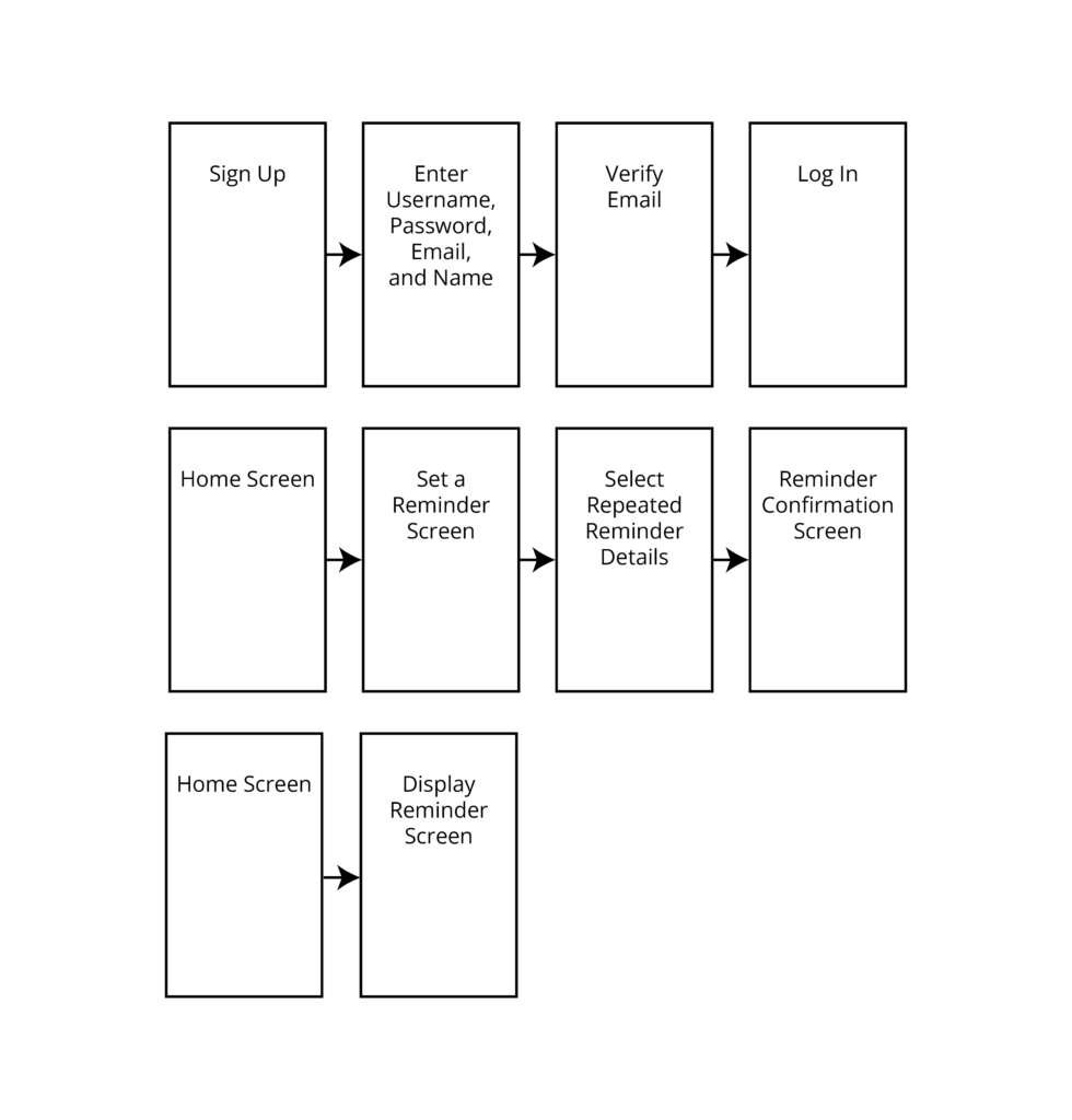
Preliminary User Flow
The next step was to decide what the focus for this user experience design, research and prototyping process: Which exact problem of the application should be focused on for this process? The user flow that was chosen to focus on was the user flow from signup to scheduling a recurring motivational reminder. This informed the creation of a preliminary user flow, which would inform the future prototyping and wireframes sketching process.
Wireframes and Sketching
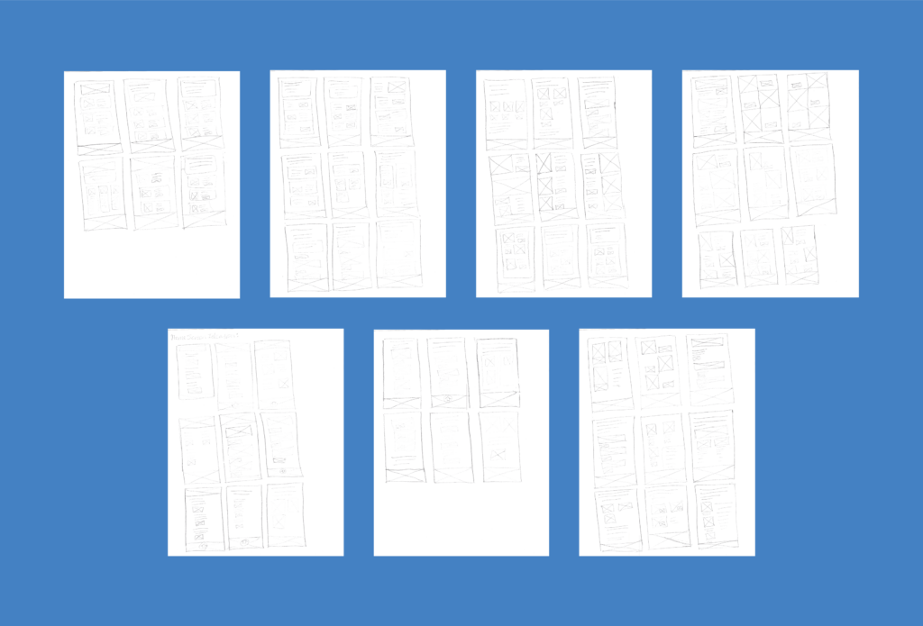
To explore layouts for the home screen, I created many wireframes through the ideation and sketching process. Because it takes a long time and many sketches to generate a useful and relevant idea, I created many sketches. As is typical for this kind of process, the sketches at the end generally were more usable and innovated in more ways that were specific for the project goals. I discarded the first set of sketches and focused on the last batch because it takes time and effort to dig up good ideas.
The process is designed to be both high-volume and messy in order to generate as many ideas as possible by sketching as many wireframes as possible.
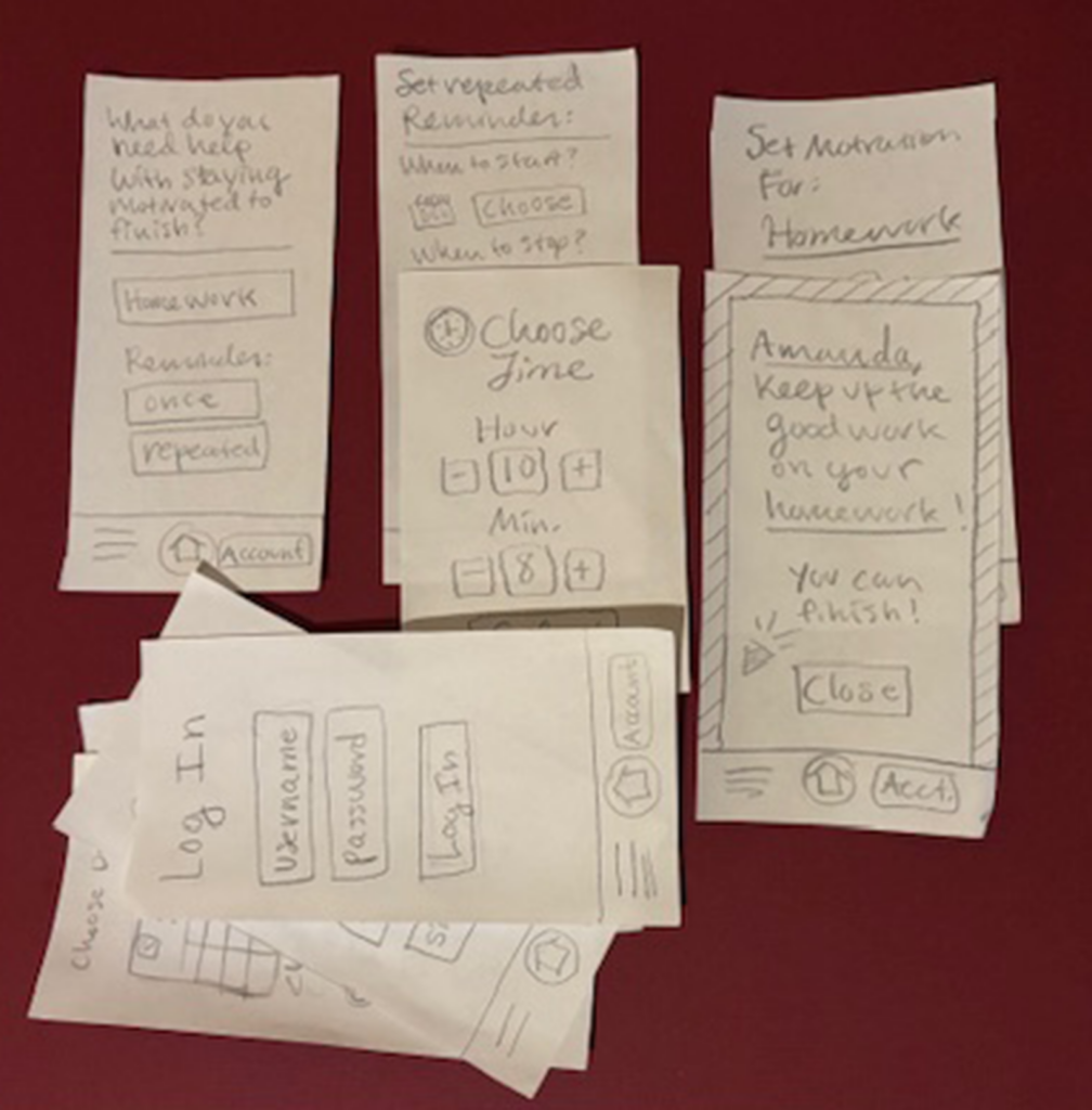
These are some of the pencil and paper wireframes that I sketched during this process:
Screen Sketching
After this process, I selected the most promising wireframes to build upon. Then, I did a series of higher-fidelity sketches to solidify details about the screens that are included in the user flow for this process.
Paper Prototyping
After completing this round of additional sketching and ideation to validate assumptions and explore layout options, I created a paper prototype to test the user flow and identify problems. I created both screens and overlays to simulate the interaction process with the prototype. This is an example of the paper prototyping process for this project:
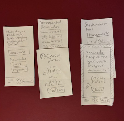
This testing revealed several insights:
First, it was generally possible to reuse the “select a time” overlays on different screens, in order to introduce consistency into the process.
Also, there should be a more intuitive way to choose the date and hour.
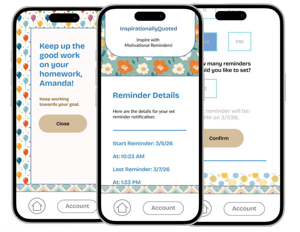
What’s more, the confirmation screen should probably be simpler, with the details more condensed, in order to be less confusing to users.
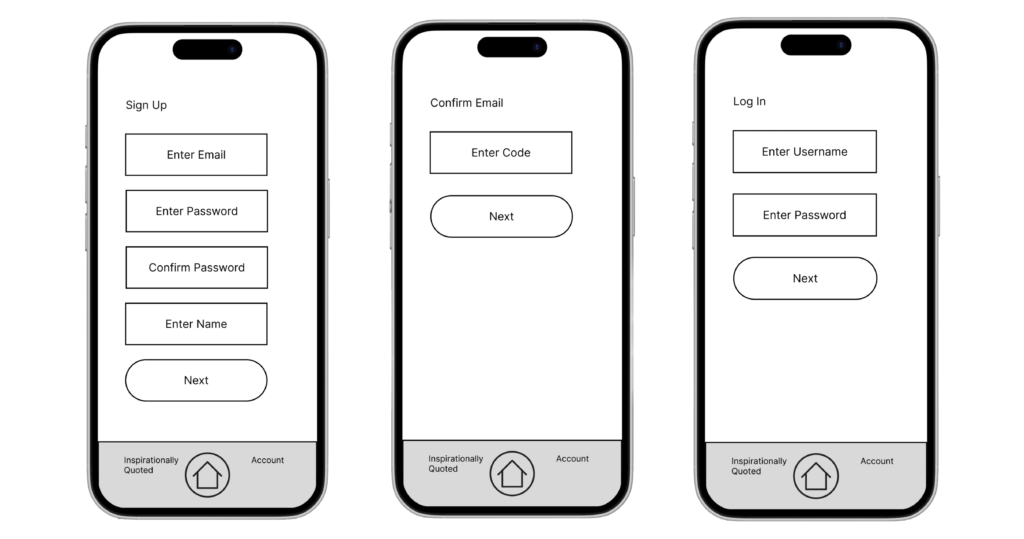
However, the sign up and verification screens generally made sense.
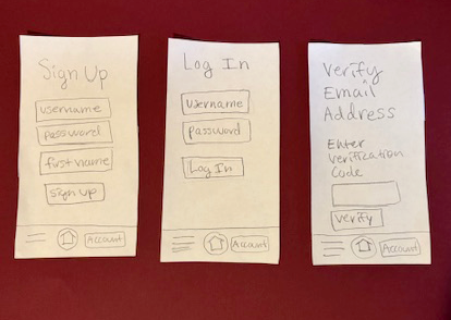
Low-Fidelity Prototype
The next step was to incorporate these changes into the sketches that were used for paper prototyping and create the low-fidelity prototype.
Takeaways from the Low-Fidelity Prototype Include:
- The need to put the option to manage current notifications within the home screen and not under the “manage account” section.
- The need to add additional explanation details to the home screen to explain what the application does before the users click on buttons.
- The need to test elements at a higher fidelity in order to have more in-depth testing of the calendar and time selection elements.
- The need to simplify the options for choosing alert times and intervals between alerts; this current screen was too confusing, especially because of the ability to open multiple pop-ups at once and have them stack over each other.
The main issue here was the information architecture and the hierarchy of the setting the alert times screen. This was difficult to implement in the prototype due to its complexity. It was even more difficult to figure out how to use. The next prototype of this application needed to focus on the usability of this screen, through simplification of details wherever possible.
The Design System
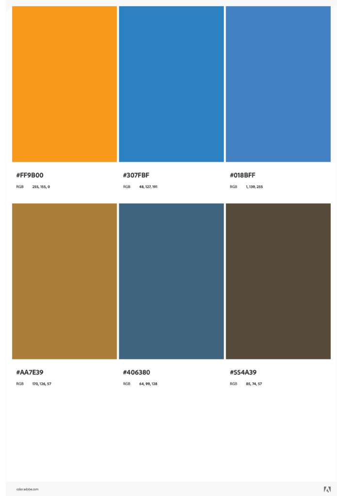
Before the low-fidelity prototype could be built into a high-fidelity prototype in Figma and created, the design system needed to be established. The first step for choosing the design system was to ideate through options for colors, in order to choose colors that would meet brand, business, and user goals. Referencing these goals set earlier, I ideated through several color scheme options, using a complimentary color scheme on the color wheel as a basis to achieve maximum contrast between elements, while providing a harmonious basis for the design. To achieve further cohesiveness, I selected only a few colors from the color scheme and used different shades of them to introduce harmony and variety.
This is the final base color scheme option that was used as the base to build the color scheme style guide for this application:
Typography Ideation
In order to meet business, brand, and user goals, as well as creating a scrapbook look and feel, the typography needed to be a friendly sans-serif or display typeface. I used open-source Google Fonts to create this typography, because these types of fonts are usable on many platforms and widely available.
I tried typeface parings, comparing them to the branding goals for this project, in order to find a typeface that would both be user-friendly and speak to the usability goals for the project.
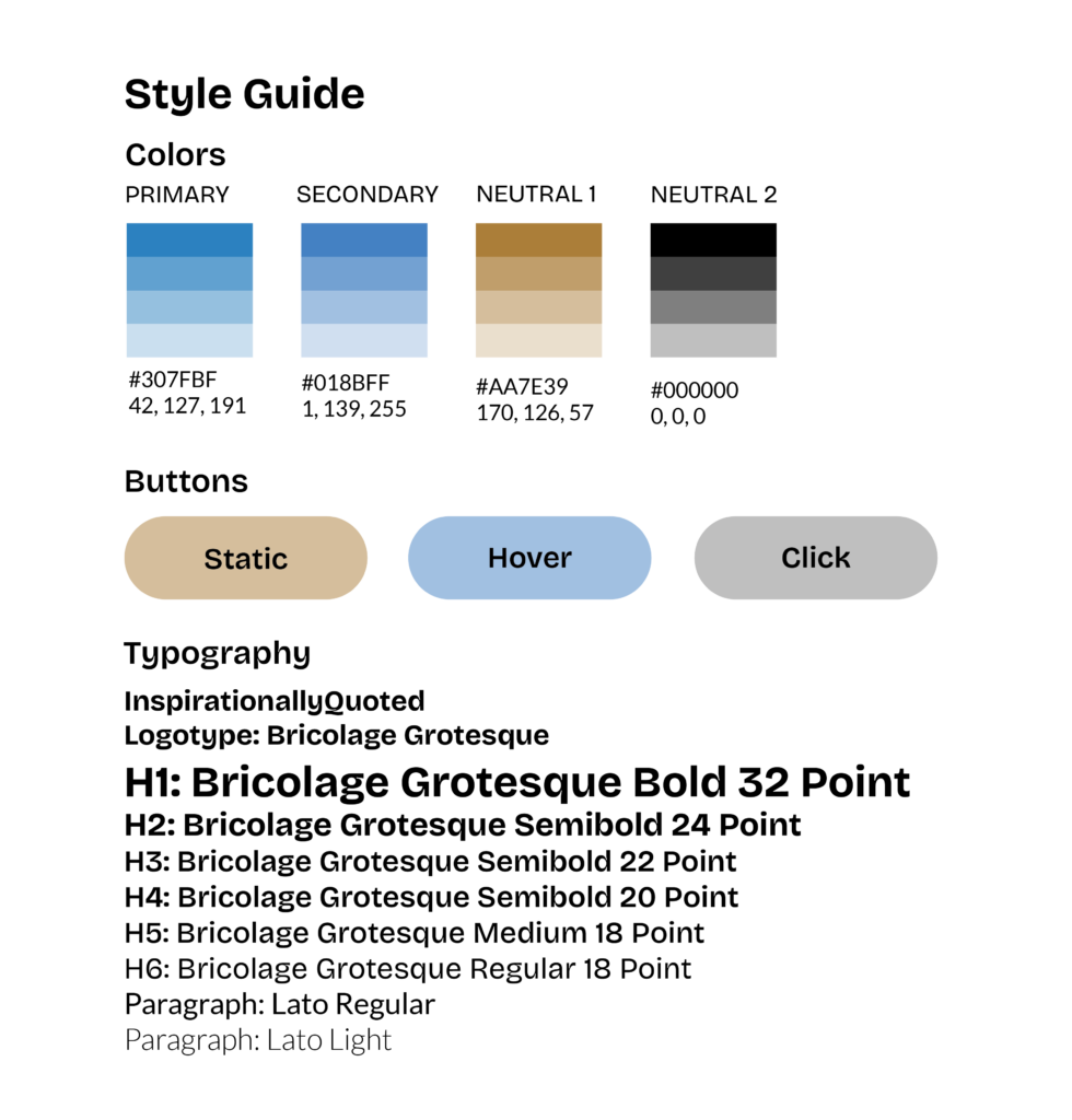
The final typeface pairing that was chosen as a result of this process was:
Logo type: Bricolage Grotesque
Headings: Bricolage Grotesque
Paragraphs: Lato
Style Guide
This was the finished style guide that was created based on these typeface pairings and the color scheme.
After choosing the color scheme, it was time to define additional elements for the design system that would support the scrapbook look. This involved introducing different patterns and textures to support business, brand, and user goals. These patterns served to increase visual interest through denoting differences between elements and introducing additional hierarchy. These choices are reflected in the final prototype.
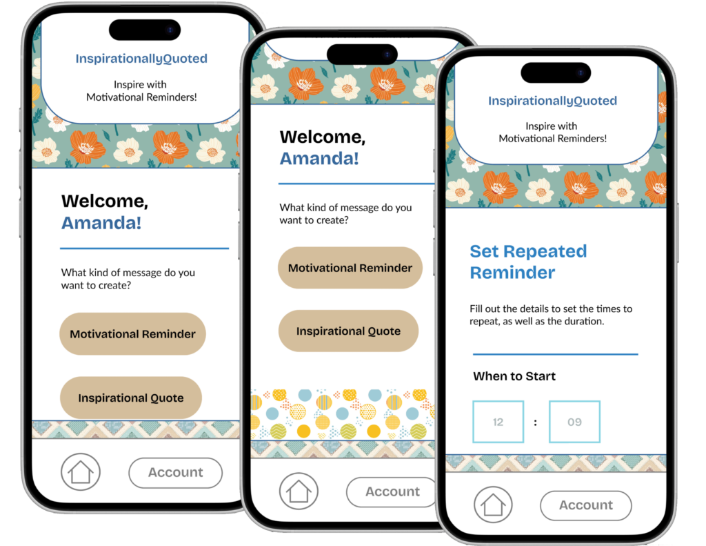
The final high-fidelity prototype was created via an iterative prototype-and-test process that resulted in one final prototype instead of intermediary mid-fidelity prototypes. To make more effective information architecture for the “choose an alert” screen, I went through multiple iterations. Some constraints were introduced to reduce complexity, which created an options-usability tradeoff. I went with the assumption that the user wants to start the alerts today, or else the user would start tomorrow. As a result, the day to start option is removed from the screen for reduction of complexity.
Instead of having pop-ups with buttons to change the numbers for the inputs, users are kept on the same screen and asked to type in their preferences. This is kept consistent across the screen. This makes it easier for users to navigate through these options, as evidenced by the final prototype. When not leaving the main screen, it seemed to be easier to understand the options without having to deal with and close multiple pop-up windows. Changing the option selection from choosing with buttons to typing in the option also reduced the amount of work for the user. Finally, a consistency of input options also helped simplify this screen.
The final prototype prototypes the specified user flow, from onboarding to successfully creating and receiving a message.