Process Overview
This process focuses on solving the problem of parking for users. The prototype focuses on making the process of parking and paying for parking as seamless as possible.
QuickParkingMeter is an application to help users pay for parking.
See the Prototype
Role
Product designer and user experience designer.
Skills Used
- Figma
- User Experience Design
- Product Design
- Typography
- Design Systems
- Ideation
- Wireframing
- Prototyping
The Problem
Users struggle to pay for parking. Problems include lacking the right method of payment for parking meters and not knowing where they parked. This can result in “pain points” for users.
The Solution
The purpose of this application is to make the parking process smoother, easier, and more efficient. The application aims to make the parking process easier and smoother for users to park.
The User’s Goals and Needs
The user needs to be able to sign up for parking and also needs to be able to sign up in a small amount of time. Paying for parking needs to be easy and not take too long, because the user is in a hurry after parking to get somewhere. As a result, the solution needs to be able to meet these goals and solve these needs.
Pain Points to Address
There are several pain points in this situation that are applicable to the process in general, as well as the problem that this application aims to solve.
- The user needs to park quickly and the process is taking too long.
- The user does not have the correct payment method.
- The user does not know the exact identification of the parking space that they have parked in.
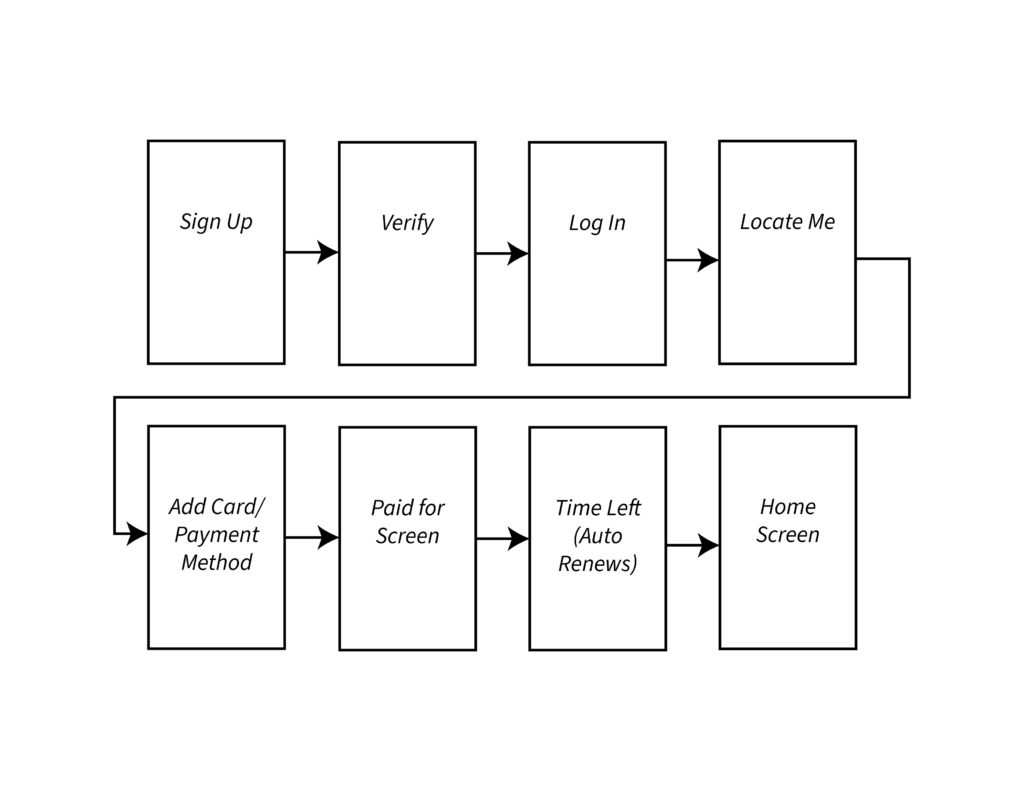
Preliminary User Flow
Based on the problem and its solution, I created a preliminary user flow for understanding how the user would interact with the application based on the user’s need, the possible solution, and the process of eliminating the pain points that come with the situation.
Business, Brand, and User Goals
There were several business, brand, and user goals that were important to consider when creating an application for solving the user’s problem in this situation.
Business goals:
- To increase their user base by making paying for parking easy in virtually any location.
- To make it easy for users to park, making more cities purchase their parking service and increasing profits.
- To create an application that is easy for users to use.
The brand goals were important to define because they would direct the direction of the look of the application, also known as its branding. These goals included:
- A clean, minimalistic, and simple user interface that lets the user focus only on what they need to do, since the goal of the application is to help users park and pay for the parking quickly and efficiently. The user interface should support this goal, and this can be reflected through the branding and visual language choices for this application.
- To be friendly and yet professional to make the app look both professional and trustworthy.
- To be easy to read, using sans-serif fonts with a strong contrast to reflect this utility.
The user goals were extremely important to define, as they would help reflect the direction of the screen layout and overall information architecture decisions. User goals put usability and the way that the application works at the forefront of the decision-making process. These user goals included:
- To park easily and quickly.
- To know what to do next to accomplish the task with little ambiguity.
- To spend as little time on the app as possible to accomplish this goal.
- To know transparently how much parking costs and how much is being spent.
- To be able to upload information and payment data into the application as quickly as possible without getting stuck in layers of forms and an intensive information input process.
Together, this triad of goals could inform the process of the application’s development and support future goals. When using these goals, it was important to prioritize the most important ones. These included:
- To know transparently how much parking costs and how much is being spent.
- To be able to upload information and payment data into the application as quickly as possible without getting stuck in layers of forms and an intensive information input process.
- To park easily and quickly.
- To be friendly and yet professional to make the app look both professional and trustworthy.
- To make it easy for users to park, making more cities purchase their parking service and increasing profits.
Functional and Non-Functional Requirements
There were several functional and non-functional requirements that the application would need to fulfil in order to meet these business, brand, and user goals.
Functional requirements included:
- To let the user locate their parking space.
- To let the user pay for the parking space.
- To let the user notify the app when they have left the parking space.
The non-functional requirements focused on general usability of the application and making the user’s experience a good experience. These non-functional requirements included:
- Making it easy to input payment methods.
- Making the parking payment process fast and easy.
- Making it easy to locate the parking space without a lot of work from the user.
- To prevent user confusion at every step of the process.
Wireframes and Sketching
The next step of my process focused quite heavily on wireframes, ideation, and sketching. This process is essential for evaluating different layouts and selecting the most effective candidates for the next step, which goes into a higher layout fidelity. Mistakes at this step are easier to catch, faster to remedy, and less impactful to the process of the project.
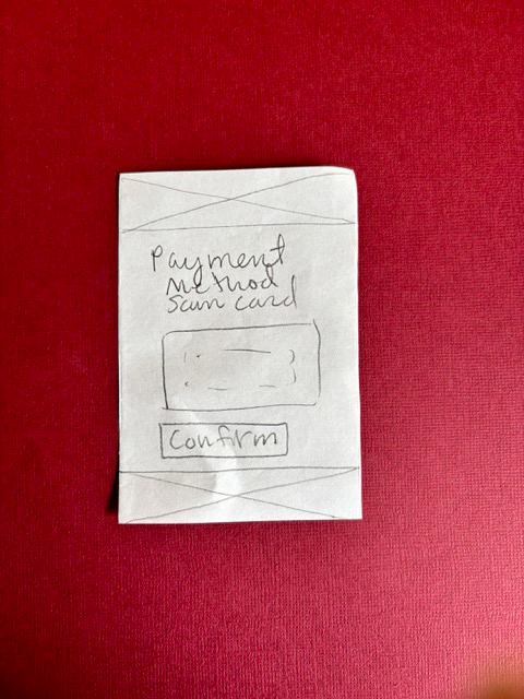
The following are some of the wireframes that I sketched during this process:
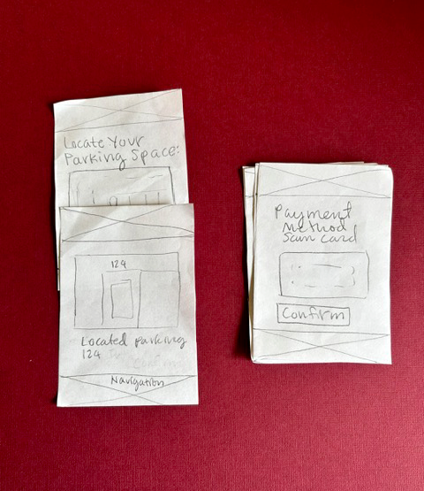
Paper Prototyping
For the next step, I combined the insights derived from wireframes and sketching with the preliminary user flows that I created to create a preliminary prototype. I tested the user flow from start to finish. Some important points emerged from this process:
- The addition of more time needed to be automatic.
- There needed to be more comprehensive and in-depth descriptions on screens about what needed to be done at each step.
- The user flow needed to loop back to a home screen in order to let the user use this process again to select another parking spot.
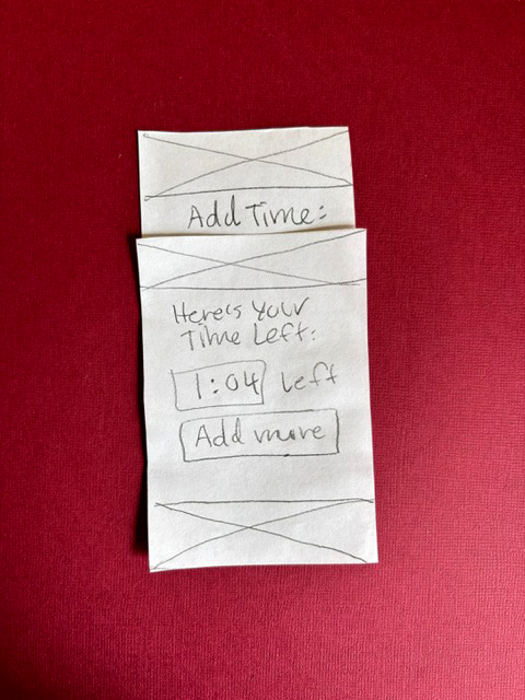
The Second Round of Paper Prototyping
I went through a second round of paper prototyping to further refine the user flows. The goal was to find usability problems before creating higher-fidelity prototypes on the computer. Paper prototyping is efficient for finding issues with usability in a form where core structural aspects can be quickly and easily changed.
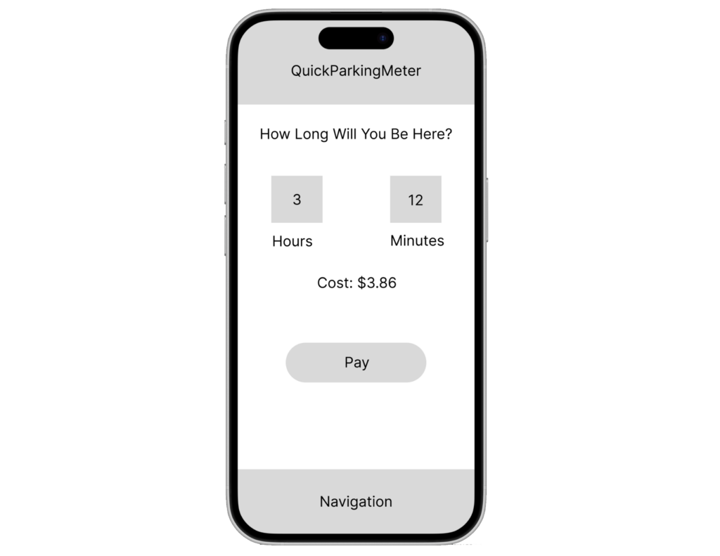
Low-Fidelity Figma Prototype
Some insights that emerged from this were that the second round had resolved most of the usability issues, and it was time to create the low-fidelity prototype. The low-fidelity prototype brought these ideas into an interactive form on the computer, using Figma.
The Design System
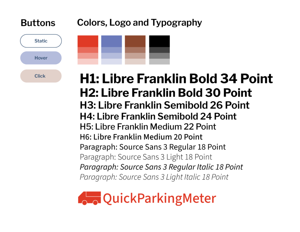
After creating the low-fidelity prototype, it was time to create the design system. This design system would create the branding and visual look of the application to create the high-fidelity user interface. The first step I took was to define the typography. For this typography, I used open-source Google Fonts. After testing typography combinations against the brand goals, I chose Libre Franklin as the main typeface, in a sans serif. A typeface that worked well with Libre Franklin for the paragraphs was Source Sans 3. As both sans-serif typefaces, they contributed to the clean look of the application, as well as a minimalist aesthetic.

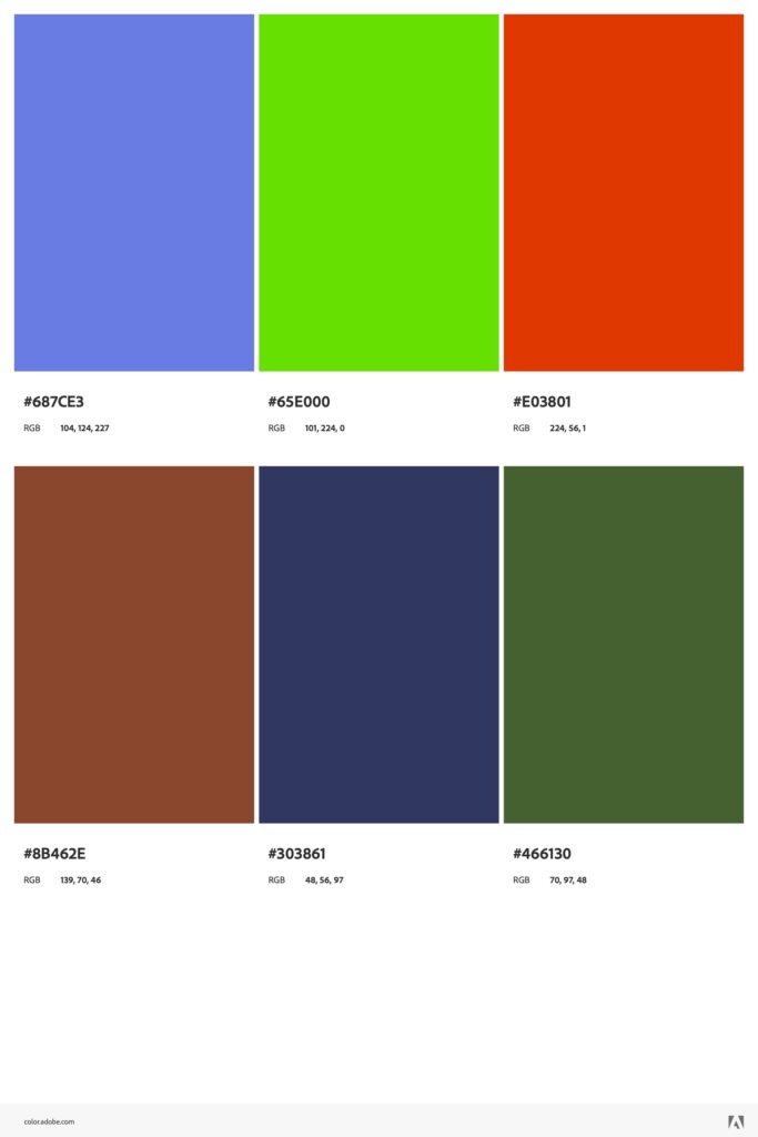
After choosing the typography, it was time to create the color system. To create this color system, I used a triad color scheme for maximum contrast, in order to promote maximum contrast and simplicity. I started with a dark red color for the main branding, and selected additional colors based on the triad color wheel scheme.
To create the logotype, I also employed an icon-based logo to place greater emphasis on the application’s branding. I combined this with a logotype in Libre Franklin for typography cohesiveness across the application. The logo also appears in the main color for maximum emphasis in the information hierarchy.
To create the branding and visual design style guide that would inform the visual user interface of the application, I combined these colors, typography, and logo into a style guide. I also defined basic button styles.
The following is the finished style guide:
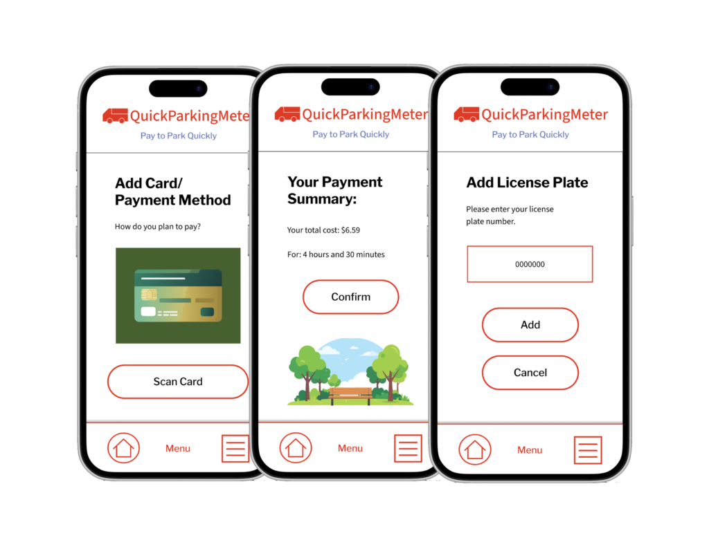
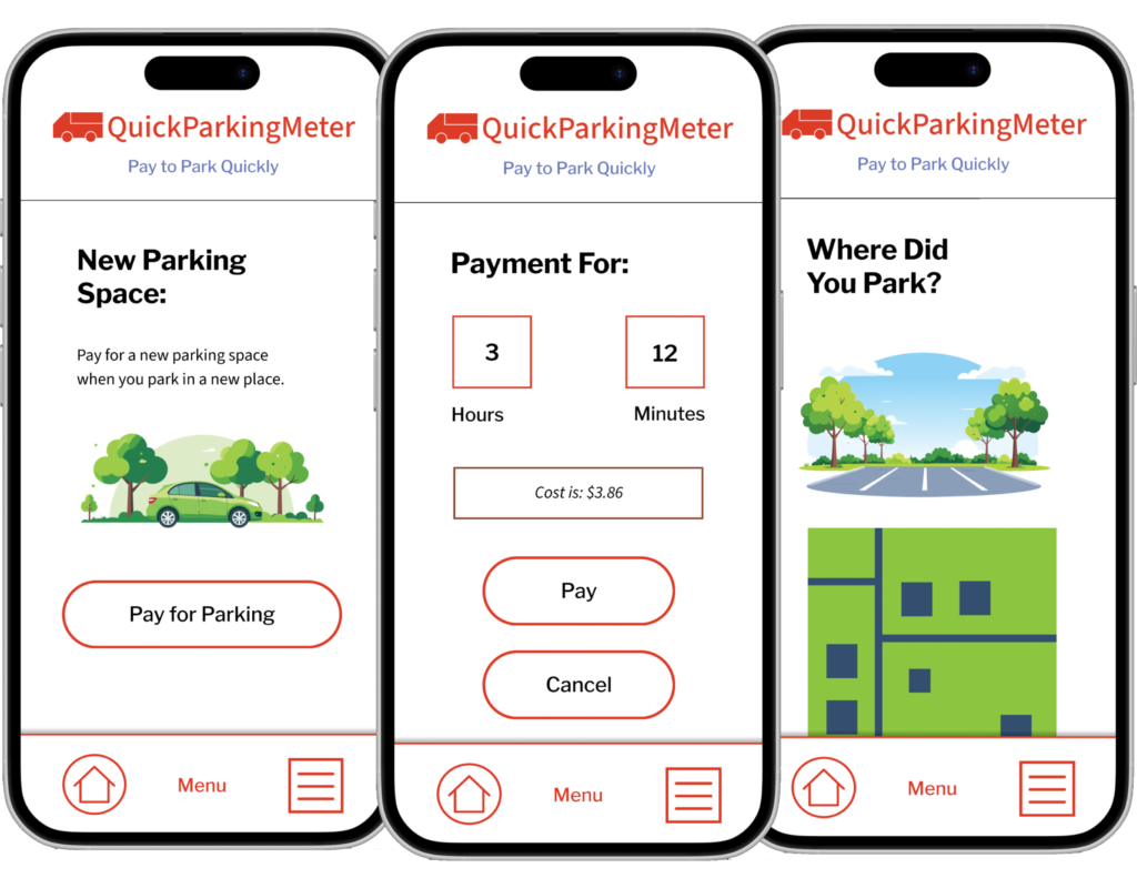
After the style guide was created, I applied these rules to the high-fidelity prototype, using the information architecture, user flows, and general layout from the low-fidelity and paper prototypes. When combined with the newly created visual design system, this created a high-fidelity prototype created in Figma for testing.
Subsequent iterations of the high-fidelity prototype mostly focused on spacing consistency, design system consistency, and creating supporting visual art for the screens. I used Adobe Firefly to generate vector illustrations to enhance the user’s experience of the application through drawing attention to key steps of the process.